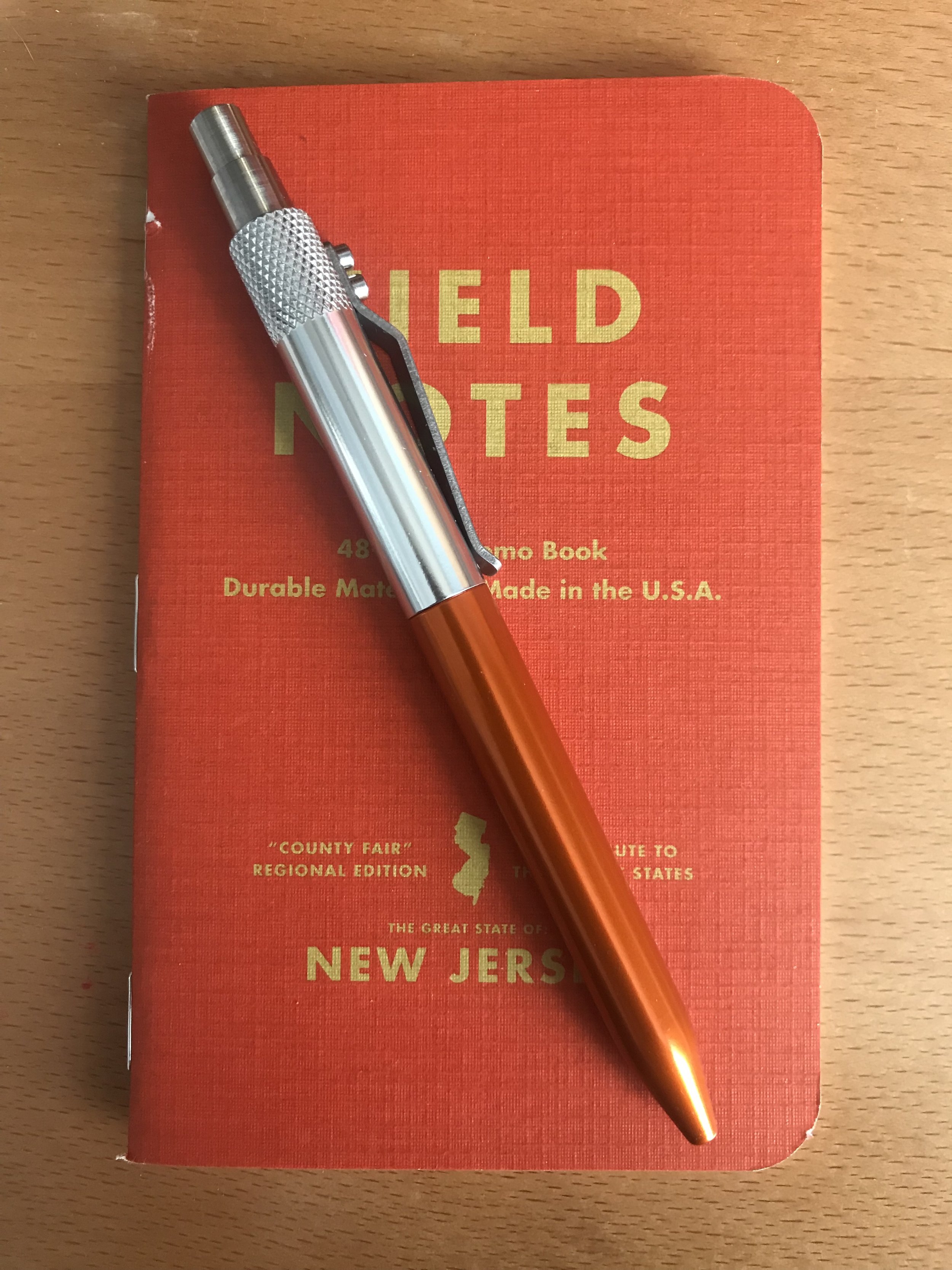
Field Notes - National Parks Edition Review - Summer 2019
Hi all and welcome back to Duck's Doodles!
Today I'm taking a look at the recently released quarterly Field Notes, Summer 2019 edition.
I LOVE Field Notes, and something about the different editions just appeal to my collectors brain. And as someone who loves the National Parks, the announcement of this edition was just like Christmas morning for me.
So let's take a look!

All 9 National Parks editions. From top left- Yosemite, Acadia, Zion, Grand Canyon, Joshua Tree, Mount Rainier, Rocky Mountain, Great Smoky Mointains and Yellowstone
Design- Outside
Let's start with the most obvious feature of this set- the gorgeous covers. Each of the 9 notebooks in the set are adorned with an illustration representing a National Park.
The parks featured are Yosemite, Zion, Acadia (series A), Grand Canyon, Joshua Tree, Mount Rainier (series B), Rocky Mountain, Great Smoky Mountain and Yellowstone (series C).
These illustrations were printed using a special, 5 color process that allowed Field Notes to incorporate the color of the cover paper (listed as "100-lb. cover stock from the French Paper Company of Niles, Michigan" on the Field Notes Site) to be used in the printing process.
A close up of the detail on the Acadia cover. The cover is the light yellow seen in the clouds.
I'm just absolutely in awe that Field Notes was able to get the results they did on these cover designs. These illustrations are gorgeous representations of the National Parks unto themselves, but the fact that Field Notes was able to get them onto their standard sized notebooks with no loss of detail just speaks to the level of commitment they constantly have to their products.
This edition doesn’t come with a belly band, but each set has a backing card with the info that normally appears on the belly band (the name of the edition, the pages, the size etc.). The other side of the backing card has a short paragraph about this edition, a list of the parks (with checklist) and info on the quarterly subscriptions.
I’m a little bummed there’s no belly band, as I usually use them as a ‘holding cell’ for my yet to be used notebooks, but I also understand that the Field Notes folks didn’t want to break up the cover designs.

A photo of the backing cards
The three binding staples on all of these notebooks are a copper color.
Design- Inside
The inside cover is a slight change to the usual design- it still has the 'For Internal Records' section where you can put the date the book was started and ended, as well as a place to put your name and contact info. The only difference keeps it in line with the theme- it gives you a section to put the stamp that you collect at the National Park you’re visiting.
The inside back cover has the usual ruler, the brief Field Notes story and notebook specifications. It also includes a short history of the National Park featured on the cover; the history of the subject is always one of my favorite Field Note features.
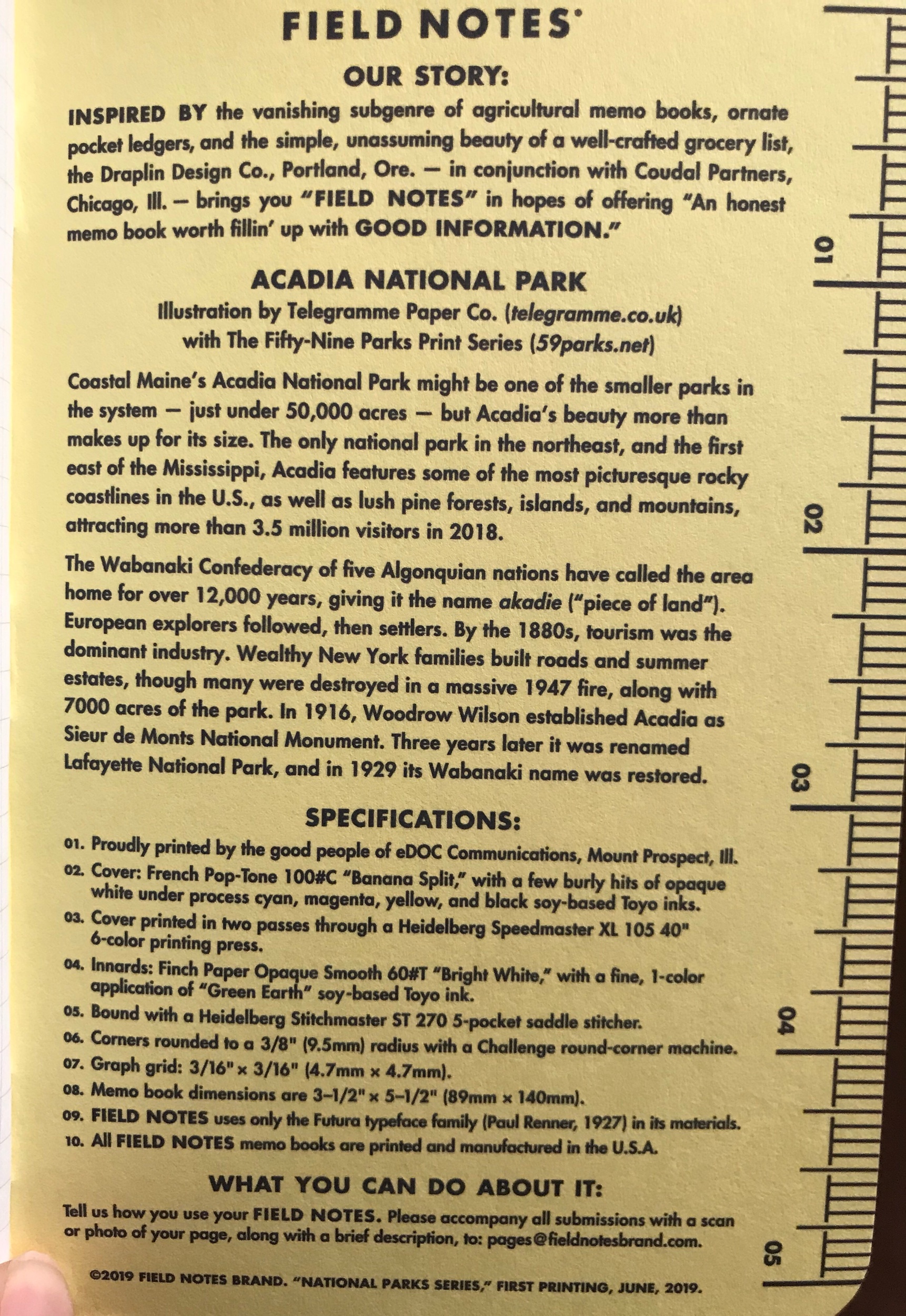
Inside back cover of the Acadia edition
The pages inside are a bright white color with grid print inside. The grid is printed in "“Green Earth” soy-based ink.
Writing Experience
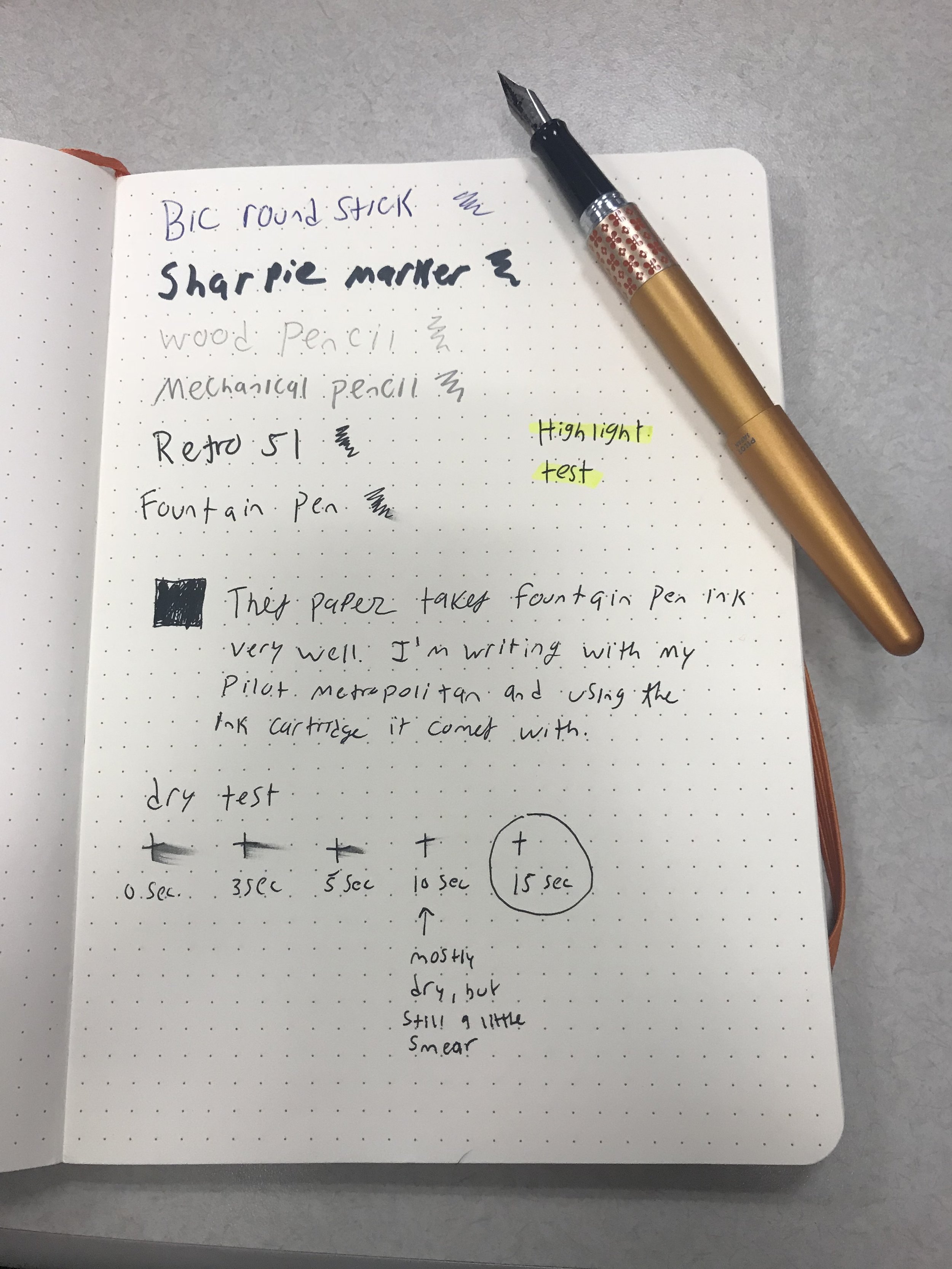
If you’ve ever written in the memo book size of Field Notes, this is no different than any others as they use their standard paper here.
If you haven’t, the paper inside writes pretty smoothly no matter the type of pen you’re using. This notebook paper isn’t fountain pen friendly, but I’ve found that fountain pen inks on the drier side have minimal bleeding, you just have to be super sure they’re dry before you turn the page. These pages also don’t work well for Sharpie or other markers.
Verdict
In short- I love this edition and you should go buy a full set right now.
In long- I don't always love the designs that Field Notes put out but I always respect their attention to detail and care they put into their products. However, this edition really checks every single box for me.
Some of my favorite Field Notes editions are the ones where they choose to do things that celebrate something, rather than only be themed around it. This edition celebrates beautiful and unique things about America, and in such a way that feels very...very Field Notes for lack of a better term. This edition feels like it was an inevitable edition to be made, and I’m just so happy that Field Notes chose to wait on it until everything aligned to make a fantastic edition.
If you’d like to pick up a set for yourself, you can buy the individual packs of 3 for $12.95 (or get all 9 because 5% of the purchase goes towards the National Park Service, and that’s pretty cool)
Note- I’m not affiliated with Field Notes or Fifty Nine Parks. I purchase everything reviewed here and all opinions are my own.