Field Notes - Winter 2019 - Group Eleven - Review

Hey everyone! Welcome to the first post of 2020! I took a short break after the hectic schedule of the Inkmas advent calendar but I’m ready to start this year off! 

I figured a great place to start is one of my personal favorites- Field Notes!

The Winter of 2019 edition is the latest quarterly release- the Group Eleven edition. 

For some background, this edition is themed around Group Eleven on the periodic table: copper, silver and gold.

The Field Notes - 2019 Winter edition, Group Eleven

The Field Notes - 2019 Winter edition, Group Eleven

Outside

The set of three are standard Field Notes size (3 1/2 by 5 1/2) with all white covers. Depending on the metal they’re representing they have that color foil stamped for the “Field Notes” logo and the info on the back.

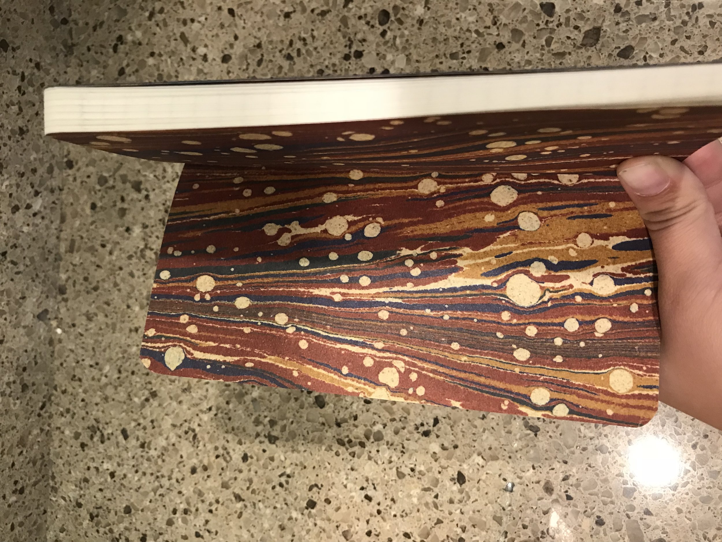
The edges of the pages are gilded with their respective metal colors, with the staple colors match.

These metallic colors really stand out on the very clean white covers. 

A better look at the gilded edges of the notebooks

A better look at the gilded edges of the notebooks

A closeup of the staples on the Group Eleven notebooks

A closeup of the staples on the Group Eleven notebooks

Inside 

The inside is made up of a dot-grid pattern. 

The dot grid is printed on a bright white paper, which certainly matches the outside. 

The dot grids themselves are printed in colors to match the foil and page gilding. These colors are pretty flat and, in my opinion, are washed out by the white page and the small dot size- especially the gold.

When I cracked these open, I was pretty shocked to see the inside of the covers were black. I think they likely did this in order to let the metallic inks really come through, but because of this when the top corners get a little crinkled or if there wasn’t a clean cut in the cover stock, it’s very noticeable.

Inside cover of the Group Eleven notebook- the ink and the fun fact sections will match whatever element of the three that notebook is themed to.

Inside cover of the Group Eleven notebook- the ink and the fun fact sections will match whatever element of the three that notebook is themed to.

Subscriber Exclusive 

The subscriber exclusive for this quarter is a fold up desk calendar- it neatly forms a standup triangle for handy date reference.

Each of the three sides is printed in an ink color that corresponds one of the three notebook colors.

Verdict 

Field Notes really swings for the fences on some editions (like with the National Parks edition) and to balance those projects they need to come up with some simple, but still story driven, notebooks. The Group Eleven edition is definitely on the simple, story driven side. 

I like this notebook. The bright white with the gilded page edges look very professional, and being a big science person I’m always for science themed Field Notes. I’ll probably use this for meeting notes, but I don’t know that I would say this edition ends up in my Top 5.

If you dig this edition, you can snag yourself a set here

Note- this review is of my own opinions, and I purchased these notebooks myself.  

Field Notes - Autumn Trilogy Edition Review - Fall 2019

Hi all and welcome back to Duck’s Doodles!

Today is one of my favorite days of the year- Field Notes Quarterly Edition review day, woohoo!

Field Notes recently released their latest quarterly edition- Autumn Trilogy.

Autumn is my favorite season- growing up in the northeast, there’s just something so special about going for a walk and seeing suburban streets lined in brilliant reds, yellows and oranges with the same beautifully colored leaves crunching under your feet. 

A closeup of the Field Notes - Autumn Trilogy edition

A closeup of the Field Notes - Autumn Trilogy edition

Outside

The Field Notes site always outlines the processes they go through to design their editions; here is where you can see all the steps they take (including a video). The shortened version is that it went from 2D model, to 3D model, to diecast master, to hot resin copies to stamp multiple at a time. They then worked through some tests with various combos of papers, inks, tints and varnishes until the perfect balance was found. 

The final result is a varnished coverstock in 3 very autumnal colors with 3 different leaf designs, bound together with gold colored staples. The orange notebook features a Sugar Maple leaf, the yellow has an American Elm leaf and the red has a Scarlet Oak leaf.

I enjoy the debossed leaves and embossed Field Notes logo on the front cover. The details that they were able to capture in the leaves are INSANE. The only problem is that these details are so subtle that you can really only notice these details in certain light (see pictures at the bottom of this section) or by running your hand over it. Additionally, the back cover has a small embossed tree with “Field Notes” at the bottom. It’s one of those nice Field Notes-y details.

I think when it comes to the colors, the Field Notes team really captured the extreme end of the spectrum for vibrant colors that can appear on trees, but I don’t think the photographs on their site (or even mine) do these colors justice. I was expecting these to be the more burnt orange and a deeper (I.e. less highlighter) yellow, but the red was exactly what I anticipated with the description of “Scarlet Red”. That’s not to say I’m disappointed in these colors, I really think these are the most autumn-y of autumn colors.

I’m particularly attached to the Scarlet Oak leaf, as it’s one of the symbols at my alma mater (go Scarlet Knights!), so that’ll probably be the first one I start using.

A close of up of the orange Sugar Maple

A close of up of the orange Sugar Maple

A close of up of the red Scarlet Oak

A close of up of the red Scarlet Oak

A close of up of the yellow American Elm

A close of up of the yellow American Elm

public.jpeg

Inside

This edition features lined paper inside and the tops of each page have 2 thin stripes that match the color of the notebook (orange, yellow, red). The Field Notes site lists the paper used as “Finch Paper Fine Ultra Smooth 70#T Soft White”.

I enjoy dot grid notebooks, and I think they’re most popular because they allow for a more flexible setup. But because it’s so popular, I just have a million pocket notebooks with dot grids. I’m pretty happy that Field Notes chose to go with the lined insides to give my collection some variety.

As with all Field Notes, this edition features a section in the front cover for you to write when you started and ended the edition and a place for contact info as well as some general Field Notes info inside the back cover.

Writing

When it comes to writing this edition is no different than any other field notes edition. It isn’t fountain pen or marker friendly, but handles everything else (Retro 51s, Bics, Pilot G2s etc.) just fine. 

Quarterly Extra- Bandana

This might be my favorite extra, but it’s mostly because my beagle Mollywobbles looks so CUTE in bandanas. 

It has the pattern of the 3 leaves around the boarder, along with a Nathaniel Hawthorne quote. 

Please enjoy a few pics of my long suffering pup enduring this bandana:

public.jpeg
public.jpeg

Verdict

I like this edition. Much like everything Field Notes does, it feels like no effort was spared to make this timely edition. 

I get the sense that Field Notes knows they’ll crush it with Autumn themed notebooks (Mackinaw Autumn, anyone?), so this edition feels like a little bit of a “Best Of” moment. 

Not to say that’s bad, Field Notes has been absolutely killing it with their last few editions, but they’ve been steadily getting more and more complex- from a whole Field Notes community treasure hunt to 9 different covers for different National Parks, there’s no shortage effort being put into these notebooks. Sometimes going back to elegant basics is a welcome change, and that’s what this edition feels like to me. This is Field Notes going back to what Field notes does best- celebrating simplicity.

I dig this edition, and it’s another one I’m glad to have in my collection.

This run is out of 35,000. If you’d like to purchase one you can start a yearly subscription or just buy this edition outright here

Note- I’m not affiliated or sponsored by any brands listed here and all items were purchased by me for review.

Field Notes - National Parks Edition Review - Summer 2019

Hi all and welcome back to Duck's Doodles!

Today I'm taking a look at the recently released quarterly Field Notes, Summer 2019 edition.

I LOVE Field Notes, and something about the different editions just appeal to my collectors brain. And as someone who loves the National Parks, the announcement of this edition was just like Christmas morning for me.

So let's take a look!

All 9 National Parks editions. From top left- Yosemite, Acadia, Zion, Grand Canyon, Joshua Tree, Mount Rainier, Rocky Mountain, Great Smoky Mointains and Yellowstone

All 9 National Parks editions. From top left- Yosemite, Acadia, Zion, Grand Canyon, Joshua Tree, Mount Rainier, Rocky Mountain, Great Smoky Mointains and Yellowstone

Design- Outside

Let's start with the most obvious feature of this set- the gorgeous covers. Each of the 9 notebooks in the set are adorned with an illustration representing a National Park. 

The parks featured are Yosemite, Zion, Acadia (series A), Grand Canyon, Joshua Tree, Mount Rainier (series B), Rocky Mountain, Great Smoky Mountain and Yellowstone (series C).

These illustrations were printed using a special, 5 color process that allowed Field Notes to incorporate the color of the cover paper (listed as "100-lb. cover stock from the French Paper Company of Niles, Michigan" on the Field Notes Site) to be used in the printing process.

A close up of the detail on the Acadia cover. The cover is the light yellow seen in the clouds.

A close up of the detail on the Acadia cover. The cover is the light yellow seen in the clouds.

I'm just absolutely in awe that Field Notes was able to get the results they did on these cover designs. These illustrations are gorgeous representations of the National Parks unto themselves, but the fact that Field Notes was able to get them onto their standard sized notebooks with no loss of detail just speaks to the level of commitment they constantly have to their products.

This edition doesn’t come with a belly band, but each set has a backing card with the info that normally appears on the belly band (the name of the edition, the pages, the size etc.). The other side of the backing card has a short paragraph about this edition, a list of the parks (with checklist) and info on the quarterly subscriptions.

I’m a little bummed there’s no belly band, as I usually use them as a ‘holding cell’ for my yet to be used notebooks, but I also understand that the Field Notes folks didn’t want to break up the cover designs.

A photo of the backing cards

A photo of the backing cards

The three binding staples on all of these notebooks are a copper color.

Design- Inside

The inside cover is a slight change to the usual design- it still has the 'For Internal Records' section where you can put the date the book was started and ended, as well as a place to put your name and contact info. The only difference keeps it in line with the theme- it gives you a section to put the stamp that you collect at the National Park you’re visiting.

The inside back cover has the usual ruler, the brief Field Notes story and notebook specifications. It also includes a short history of the National Park featured on the cover; the history of the subject is always one of my favorite Field Note features. 

Inside back cover of the Acadia edition

Inside back cover of the Acadia edition

The pages inside are a bright white color with grid print inside. The grid is printed in "“Green Earth” soy-based ink.

Writing Experience

If you’ve ever written in the memo book size of Field Notes, this is no different than any others as they use their standard paper here.

If you haven’t, the paper inside writes pretty smoothly no matter the type of pen you’re using. This notebook paper isn’t fountain pen friendly, but I’ve found that fountain pen inks on the drier side have minimal bleeding, you just have to be super sure they’re dry before you turn the page. These pages also don’t work well for Sharpie or other markers.

Verdict

In short- I love this edition and you should go buy a full set right now.

In long- I don't always love the designs that Field Notes put out but I always respect their attention to detail and care they put into their products. However, this edition really checks every single box for me. 

Some of my favorite Field Notes editions are the ones where they choose to do things that celebrate something, rather than only be themed around it. This edition celebrates beautiful and unique things about America, and in such a way that feels very...very Field Notes for lack of a better term. This edition feels like it was an inevitable edition to be made, and I’m just so happy that Field Notes chose to wait on it until everything aligned to make a fantastic edition.

If you’d like to pick up a set for yourself, you can buy the individual packs of 3 for $12.95 (or get all 9 because 5% of the purchase goes towards the National Park Service, and that’s pretty cool)

Note- I’m not affiliated with Field Notes or Fifty Nine Parks. I purchase everything reviewed here and all opinions are my own.

Field Notes - Mile Marker Edition Review - Spring 2019

Hey there, welcome back to Duck’s Doodles! 

Today I’ll be taking a look at the Spring 2019 Quarterly Field Notes- the Mile Marker edition.  

So lets get into it! 

A closer look at the Field Notes Mild Marker Edition. You can really see the foil on the Deer sign book

A closer look at the Field Notes Mild Marker Edition. You can really see the foil on the Deer sign book

Outside

These notebooks are a standard Field Notes size at 3½" × 5½" and are themed around celebrating the USA highway system so naturally they’re modeled after signs. A green exit sign (my personal favorite since these things are a staple of my life in New Jersey), a blue interstate sign and a yellow deer crossing sign. 

These designs are simple but attractive. They’re certainly not “original”  in the traditional sense but these minimalist designs are the type of thing I love to see and it feels very much like a Draplin Design piece (just check out this postage stamp Aaron Draplin designed) 

The borders of the sign and the writing is all foil, which gives it a nice shine as if these have the reflective designs of real street signs. I think it would have been a cool opportunity to have something else printed on the back but sometimes simple is better. 

I also have to mention the small details- the staples are colored black on the deer sign and white on the other two notebooks and the mile marker design on the belly band for the edition. Something I always admire about Field Notes is the little details like these- they really bring the project together and demonstrate how much these folks care about their notebooks. These are little details you might not notice (or care about) but it’s things they notice and with things like this details are everything.

Inside

The pages inside are the usual Field Notes paper (Domtar Lynx Opaque Smooth 60#T in “White” for folks who are interested). The page design is a dot graph with the light grey ink. I’ve found dot graph paper to be the “Goldilocks design”; it’s not as open as a blank page but it’s not as restrictive as lined paper so it appeals to the most amount of people.

As always, the inside back cover features short blurb on the Field Notes company, the specifics of the notebook itself and some “Practical Applications”- a fun list of themed suggestions to use the notebooks on.

Inside the edition- showing off the back cover as well as the dot grid paper

Inside the edition- showing off the back cover as well as the dot grid paper

Writing

The writing experience is pretty standard for a Field Notes notebook- fountain pens and sharpie bleed through and it handles things like ballpoints with no problem. This paper isn’t advertised as fountain pen friendly (as much as I’d love if it was!) so no surprises here. 

The Map

The map is the “add on” of this edition. It’s a genuine impossible to fold glove compartment map, but loaded with some extra information.  

There’s Field Notes usual background info talking about the origin of the Highway Program, a guide on changing a tire, a guide on jumping a battery, an explanation of the mile marker numbering system, a list of toll systems (E-Z Pass or bust!), a license plate checklist, time zones, the full map of the US highway system and, adorably, directions to get to Field Notes HQ.

The Map

The Map

I really enjoy the design of the map- the Field Notes site calls it “a beautiful and thoughtful data design solution” and I wholeheartedly agree. It’s a clean, crisp and thoughtful design. If you’d like to learn more about the project from the designer Cameron Booth, here is a link where it’s discussed.

Verdict

I love this edition. Full out. It’s not the most original but this edition just feels like a Field Notes edition. They’re simple, beautiful and meaningful designs. It’s celebrating something in a cool, thoughtful way. I’m a total sucker for things like this (I mean c’mon I love 99% Invisible as much as you other beautiful nerds). I can see why it’s not for everyone, and maybe it’s my love of all things road trips that is tainting my judgement here but I’m really excited to use these notebooks.

If you’d like to pick up your own, this edition is out of 35,000 and can be purchased here

Field Notes - Clandestine Edition Review - Winter 2018

Hello and welcome back to Duck’s Doodles!

Today we’ll be looking Field Notes’ latest release- the Clandestine edition.

This edition is all about the ciphers and puzzles, and was made in conjunction with “The Mystery League”, a game making company that designs escape rooms, table top games and scavenger hunts.

Clandestine Field Notes and Cipher

Clandestine Field Notes and Cipher

Outside

This edition features a black matte front cover, a grey back cover, and black text. The “Field Notes” text is a foil inlaid in the front cover. Well, on one notebook it’s “Field Notes”, the other two are *gasp* CIPHERS! As mentioned before, ciphers represent the theme of these books.

The back cover features a handy translation system, which includes Morse Code, Pigpen and NATO translations of the alphabet.

My only negative comment about the outside of this notebook is the matte material of the cover tends to hold on to finger prints. Something to consider if you’re particular about your notebooks like I am

The three pack spread out- here you can see the different cipher keys being featured in place of the “Field Notes” title

The three pack spread out- here you can see the different cipher keys being featured in place of the “Field Notes” title

Inside

The inside features dot-graph paper. This was a nice return to form from the previous End Papers edition. The dots are a light grey, which is my personal preference as it I find anything darker can be a bit distracting or restrictive when it comes to dot grids.

Additionally, some of the dots in the various grids of the notebook are noted to be out of place which, you guessed it, is another part of a cipher.

The inside of the front and back covers contain the standard Field Notes things- the inspiration for these notebooks, the “if lost return to” section etc. But what’s different about this edition is that the inside each of these books there is some extra information about different types of ciphers and their histories.

A closeup of the first notebook’s blurb about ciphers- this one features information on

A closeup of the first notebook’s blurb about ciphers- this one features information on

The back of the notebook features a breakout of several different types of codes based on the Latin Alphabet

The back of the notebook features a breakout of several different types of codes based on the Latin Alphabet

Writing

Writing in this notebook is a standard field notes writing experience. Sharpies and fountain pens bleed through, but most others don’t bleed or ghost through.

FullSizeRender.jpg

Scavenger Hunt

The biggest part of this notebook is the scavenger hunt that was constructed around it. The subscribers were given a cipher key wheel to help with a subscribers only puzzle. However, I believe the puzzle that was hidden within the notebooks is able to be accessed by anyone, and the starting point can be found here.

It’s incredibly clear that this was designed to be a collaborative effort, so if you’re interested I suggest you join in the fun!

Verdict

What happened with this edition is that Field Notes wanted to create a giant scavenger hunt, and then created a notebook to go with it. And that’s not a bad thing! This edition feels like Gravity Falls: The Notebook. And I love it. I’m a huge fan of these types of things; I love when companies and people do these huge scavenger hunts and I do escape rooms for fun. These massive events are a good time and it feels like it really engages the community.

If puzzles aren’t your thing, or if you aren’t participating in the scavenger hunt, this is still a really cool edition to have. I love the black on black look- the matte black cover with the foil writing looks really classy.

This edition is currently available for $12.95 plus shipping on Field Notes’ website

Have fun, happy writing and happy puzzle solving

-Duck

End Papers- Field Notes Fall 2018 Quarterly Edition Review

Welcome back to Duck’s Doodles! I apologize for the lack posting these past two weeks; sometimes you need to reshuffle priorities in life and this break helped me do just that. With that said I’ve gotten some great pen based goodies in the last few weeks so I’m excited to start writing regularly again! 

One such goodie is the latest Field Notes quarterly edition- End Papers. So without any further hesitation, let’s get on to the review

IMAGE.JPG

Outside

The Timber Green and Nighshift Blue are shown off here, as well as the debossed writing

The Timber Green and Nighshift Blue are shown off here, as well as the debossed writing

Let’s start with the most obvious feature of this edition- the unusual size. This notebook is tall and narrow, with its dimensions being 3.5” x 7”. The first pictures I saw had me concerned that the height would make it more flimsy but I was pleasantly surprised by how sturdy this book is. The covers give it a bit of flex so it wouldn’t be uncomfortable to tuck into a back pocket but keep it strong enough so that I wasn’t worried about throwing it into my work bag. The sewn bindings give the spine a genuine feel of being a vintage personal journal- the type of binding that is fun to break in and see wear.

This edition came with two books- one in Timber Green and one in Nightshift Blue. I’m always partial to blues so I particularly love this shade but the green adds a good variety to the pack.

The cover texture, debossed writing and general look of this edition reminds me of a collection of Hemingway books my grandmother had- which says to me they nailed the intent. 

Inside 

The size of this edition isn’t the only unique thing; the paper is lined on the right hand side and blank on the left, much like the Arts edition from the “Arts and Sciences” quarterly release.

This book features a similar paper and identical, sewn bindings to the Dime Novel edition. The paper in the Dime Novel edition is probably my favorite paper I’ve experienced in a Field Notes book to date so this was a nice treat. The lined pages are lined in a light grey color, which helps the vintage feel of this notebook.

The ‘end papers’ (that traditionally serve as structural binding in books) are faithful recreations of two very unique 19th century end papers . I also encourage you to watch the video posted in the page for this edition, it’s entirely mesmerizing to see how the paper is marbled to create these looks. Because of these end papers, the usual Field Notes information and “This notebook belongs to” page are on the first available non- end paper page.

One of the 19th century end papers recreated

One of the 19th century end papers recreated

One of the 19th century end papers recreated

One of the 19th century end papers recreated

Verdict  

End Papers edition with book.JPG

I wasn’t sure how to feel about this edition when it was announced- to be blunt I wasn’t thrilled. I enjoy the usual Field Notes size, as it’s much more practical for my daily use. I also was uneasy about the one side lined one side blank paper lineup.

But then I actually got this edition in my hands and I realized that while for some these are a perfect every day use edition, for me these are meant to be a special use notebook. This is meant to mimic the old school personal journals and they absolutely hit that mark.

This edition feels like it’s meant to be a very personal use item; meant to help you keep track of what you’ve done and where you’ve been while doing it. Maybe it’s because these notebooks remind me of the Ernest Hemingway books my grandmother left me when she died, or maybe the recent break has had me thinking about the things I want to keep track of in my life, but this edition feels like it’s going to have a special place in my heart.

This edition is currently available at $12.95 a set on the Field Notes site

As always, thanks for reading and happy writing

-Duck

Review- Field Notes Dime Novel Edition

Hi all! Welcome back to Duck’s Doodles

Today I’ll be talking about one of my favorite subjects ever….FIELD NOTES!

Every Field Nut is waiting in anticipation for the next quarterly release, so I figured now would be a perfect time to discuss last year’s fall quarterly release, and one of my most recent Field Note acquisitions, the Dime Novel Edition

Field Notes Dime Novel Edition- Font Cover

Field Notes Dime Novel Edition- Font Cover

Field Notes Dime Novel Edition- Back Cover

Field Notes Dime Novel Edition- Back Cover

Outside

Let’s start with a discussion of the outside of the notebook.

As noted on the web page for the Dime Novel Edition, the folks over at Field Notes were inspired by the Beadles brothers. The brothers printed up inexpensive books on a variety of subjects, and then began to release novels in this format. Once the novels were printed up, the demand for pocket sized stories took off.

Field Notes used the orangey cover for their book, coming pretty close to the featured photo of an original (well worn) Dime Novel. Another clear bit of inspiration is the double lined black boarder surrounding the text, a very clear riff on the original Dime Novel black boarder.

One of my favorite details that is featured here is the Field Notes ‘seal’, embossed prominently in the middle of the book, just as the “One Dime” seal is featured on the original Dime Novels.

All in all, I’d say the folks gave this notebook the look of the classic Dime Novels that they were looking to emulate.

Detail of the printing press

Detail of the printing press

Inside

The insides of either cover contain their standard Field Notes items- a ruler, specifications, a start date/end date field, a place to return, general Field Notes info and the info on the specific edition.

There are a few items that are atypical about the inside of this edition. The printing press image on the first page, as well as the page numbers on the top left corners are the first two that jump out at me.

What’s notably different is the pages themselves- the paper feels a bit thicker than most of the other editions I’ve owned and instead of the traditional staples, the binding is sewn.

The paper is also blank, which I found to be a curious choice for this edition- though I suppose many folks aren’t fans of lined Field Notes and lined or blank would be the types of paper that would be at home in this edition.

Inside front cover

Inside front cover

Inside back cover

Inside back cover

Writing sample on the paper

Writing sample on the paper

Writing

This paper lends itself to a nice writing experience with a variety of writing instruments. It takes fountain pen ink and highlighting well, and did about as well as one could hope with a Sharpie marker.

There was some ghosting on the other side, and this paper did offer a bit more “feedback” while writing than some others, but it really added to the overall feel of the notebook itself

I could see some other folks not enjoying the way this book is bound- it seems to be more like three smaller notebooks sewn into the larger one, which makes it a bit awkward to have lay flat. So if you were planning on using this notebook for a regular writing notebook, that’s something to consider

Verdict

I love this edition. I love the paper, I love how durable the cover is, I love the sewn binding, I love the debossed printing, I love the size, I love the look. I love everything about this edition.

Truly, I think this is one of Field Notes best works to date. The detail and the passion that went into researching this edition is what Field Notes is all about. Fusing niche loves of American history with modern design and bringing it to a whole new generation of folks to enjoy.

These have sold out, but you can get your hands on them fairly easily on eBay or from various re-sellers. And if you can get a copy, I suggest you do.

Thanks for reading, happy writing!

-Duck