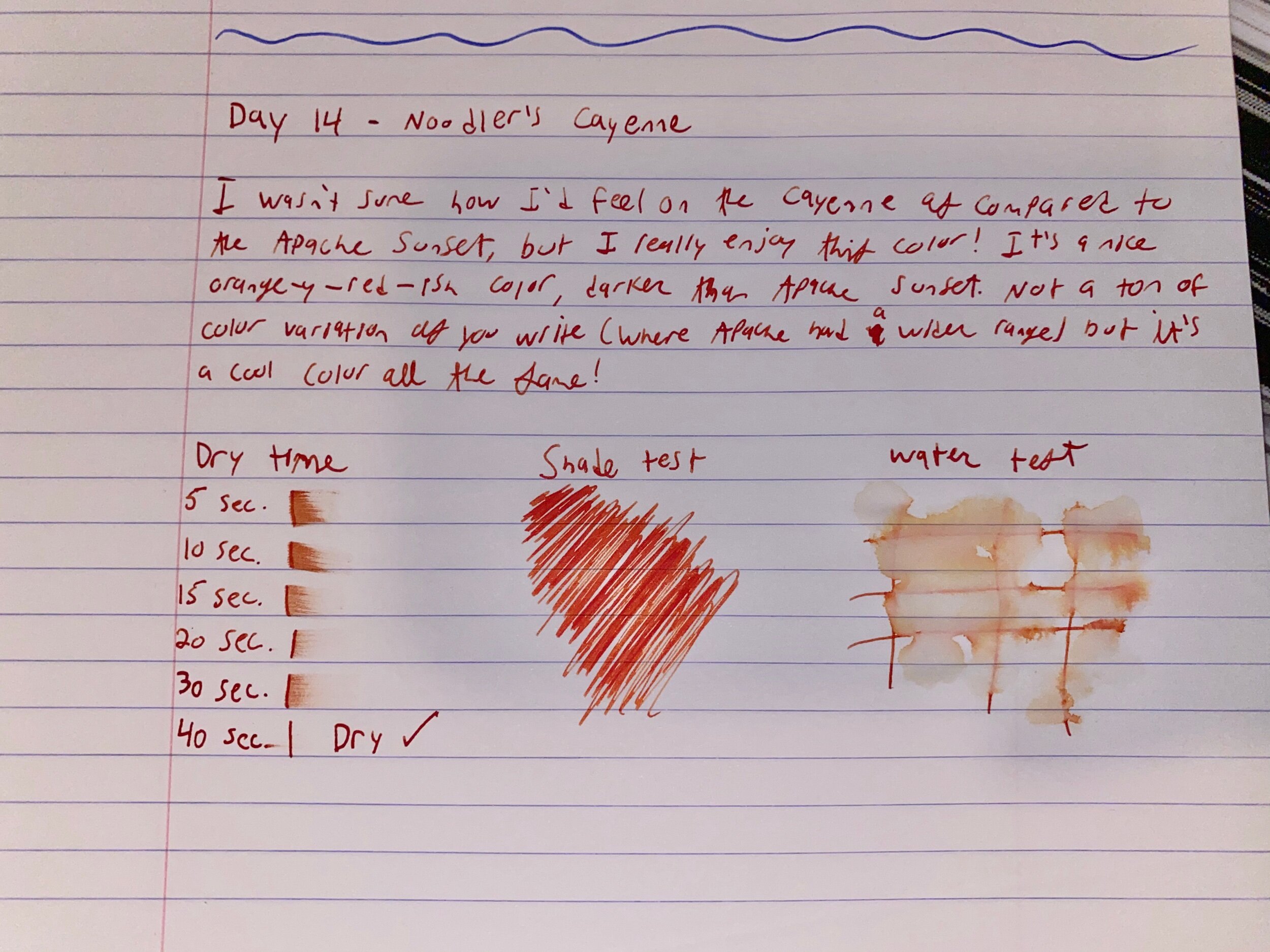
Noodler’s - Cayenne - Ink Review

Hi all and welcome to Day 14 if Duck’s Doddles Inkmas!

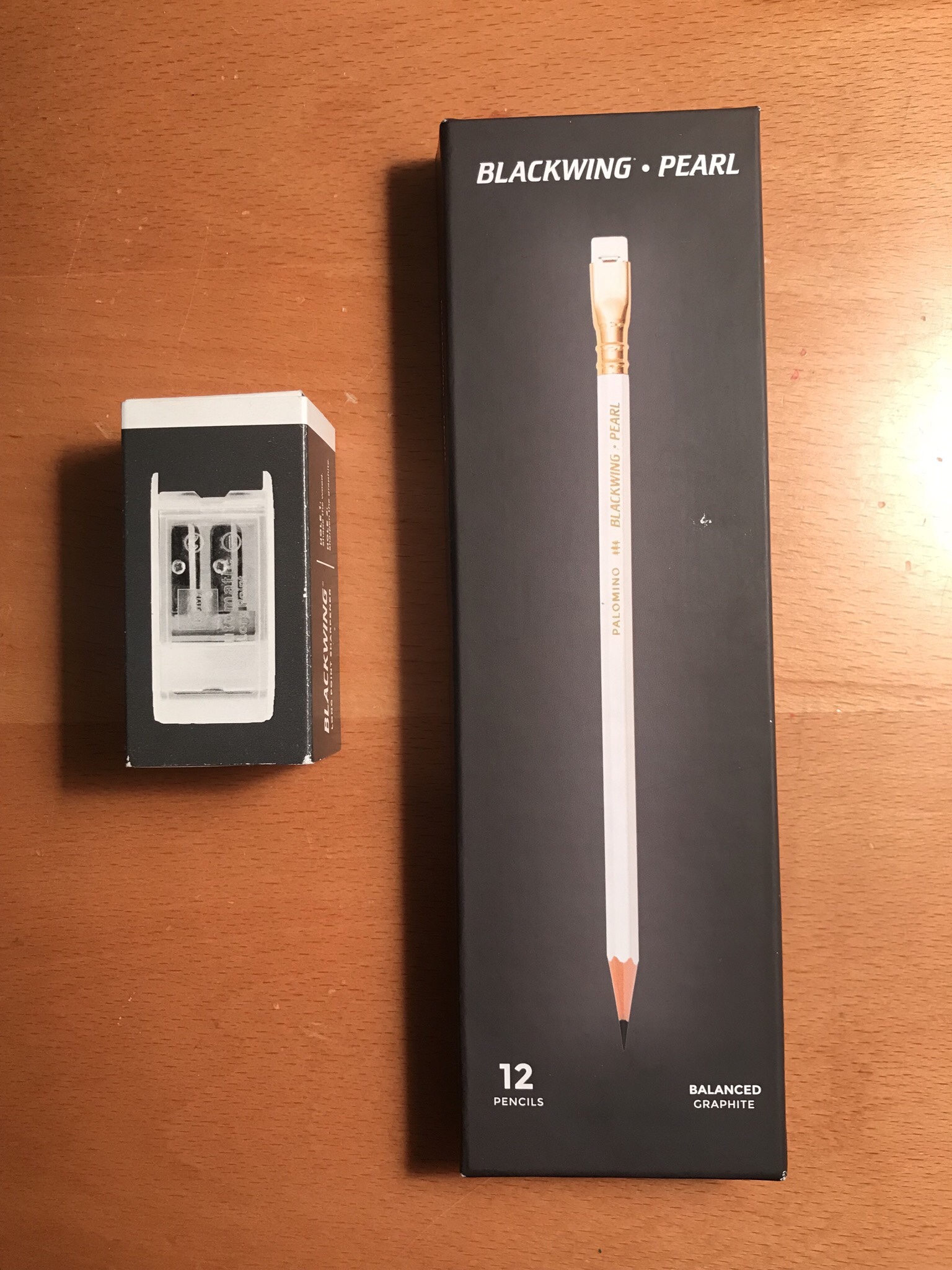
Out of today’s grab bag I pulled Noodler’s Cayenne 

Let’s get to it!

Adjustments.jpeg

Writing

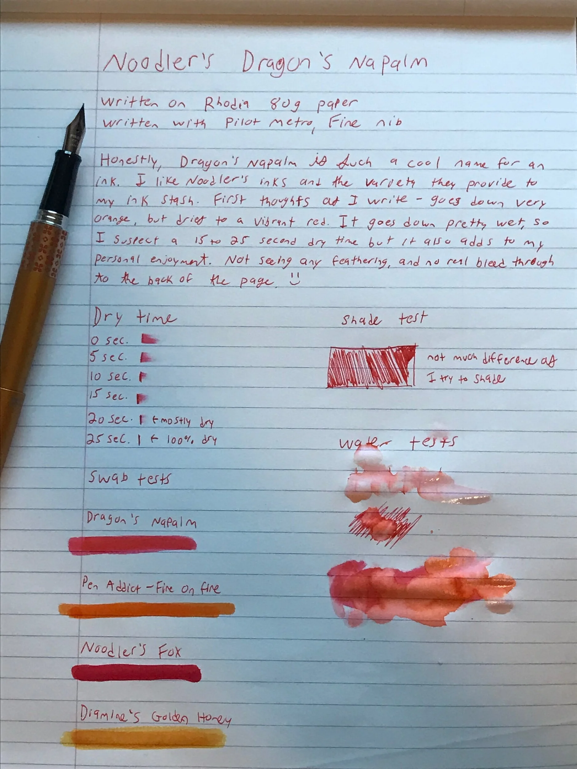
This ink definitely goes down on the wetter side, and has a nice flow to it. I didn’t have any trouble getting this ink started in my Noodler’s Nib Creaper

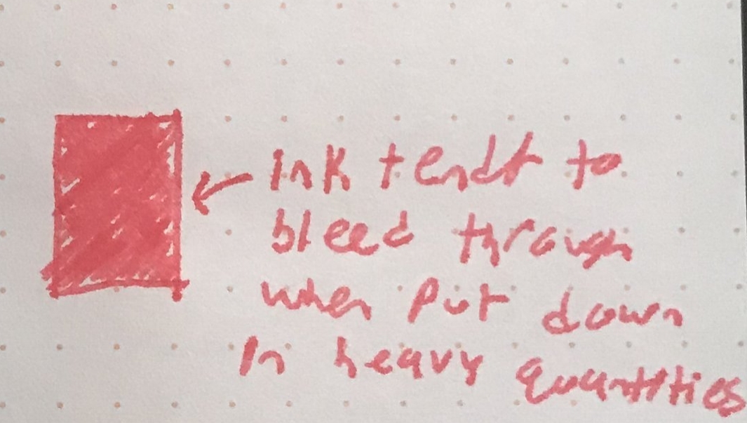
I didn’t have any feathering on my Rhodia notepad but 100% saw feathering on every other paper I tried- field notes, copy paper and sticky notes 

Dry Time

I’ve seen this ink written about before and most folks said it has a quick dry time, but mine was pretty firmly between 30-60 seconds depending on the paper. 

Now, I did only have this ink loaded up in the Nib Creaper, which has a flex nib, so maybe it was really just spitting the ink down on the page. 
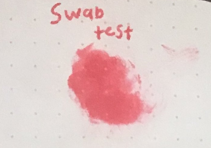
Water Test

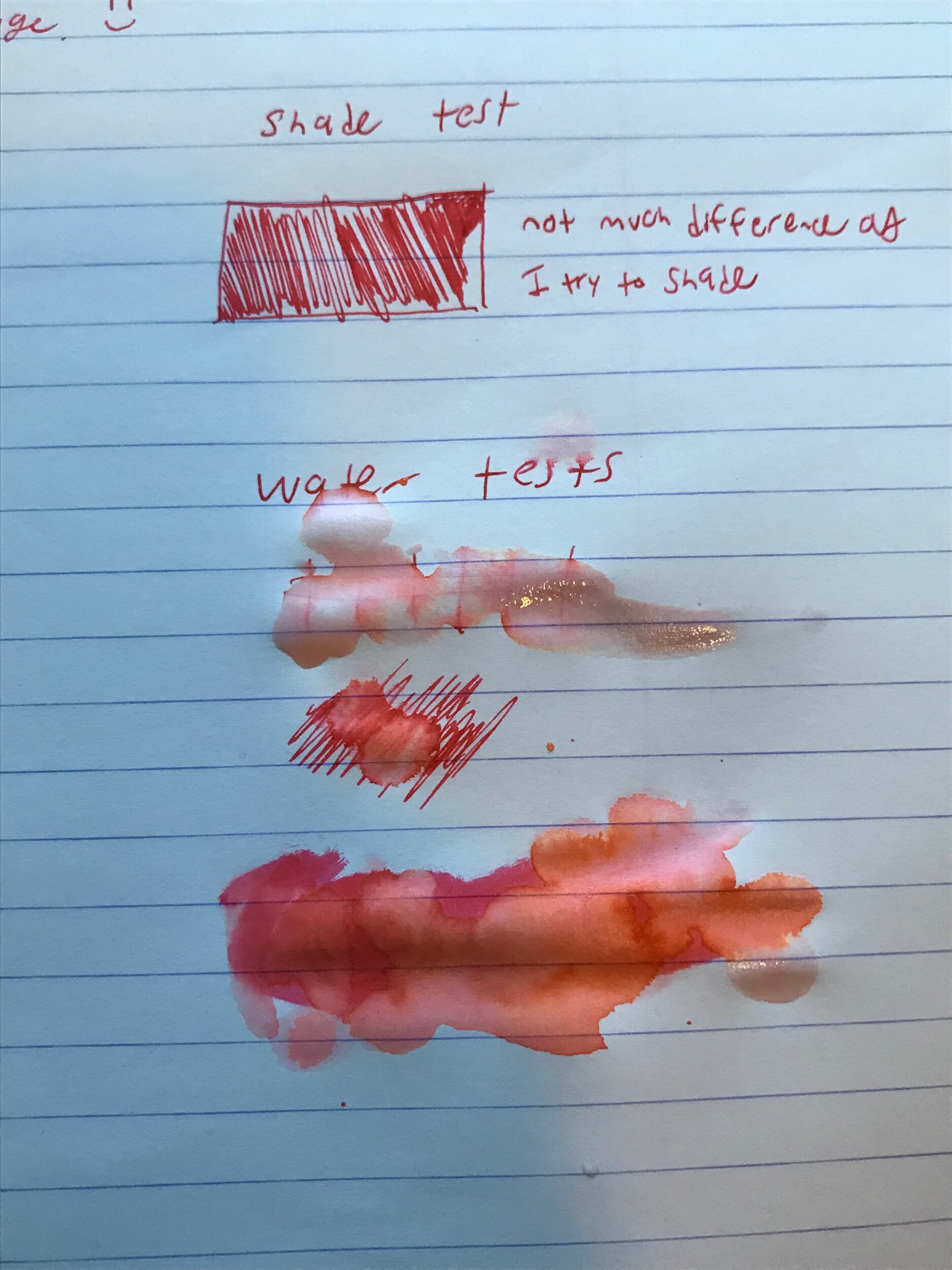
This ink isn’t water resistant and it isn’t advertised to be.

This has been one of my favorite water tests because it really deconstructed the ink- you can see the shade range of yellows and oranges that are in this ink.

If you like using your fountain pen inks for art, this is a good candidate for you to get a bunch of different shades with.

Color

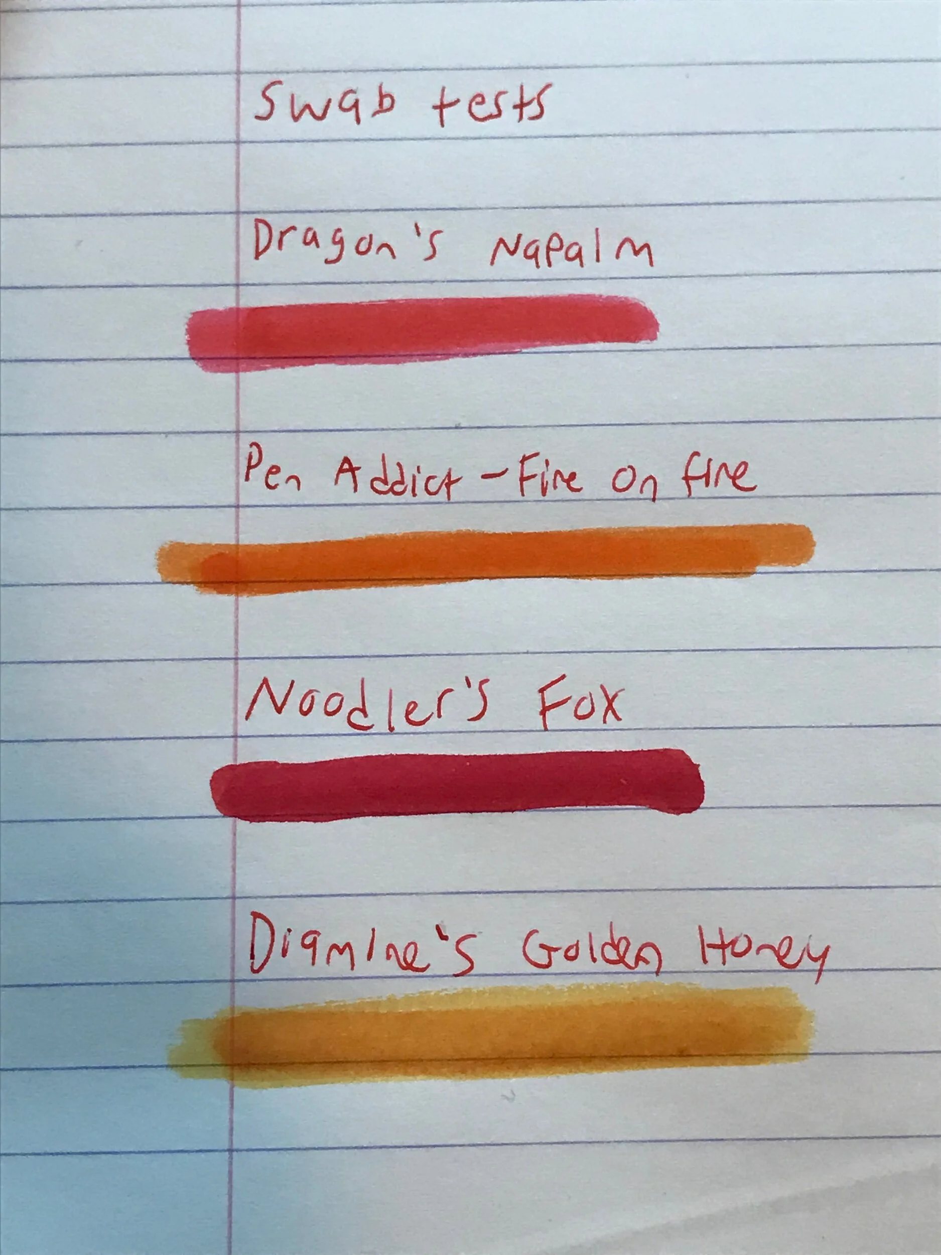
This ink is the next in the shade range after Apache Sunset- where Apache was a golden honey yellow to a light orange, this is a light orange to a dark orangey-red color. 

It’s a pretty vibrant shade of orange,  it definitely is a bit more flat than the Apache Sunset. I didn’t notice as much shade variation while writing.

Verdict

I like this ink! It’s not as easy to get a range of shades as other inks but it stays  in a color family it does well. It goes down well.

If you like orange inks and want to add a little flavor to them, this is a good candidate. 

Thanks for reading, happy writing and see you tomorrow for day 15!

Mystery ink review

Hi everyone, welcome to day 8 of my Inkmas calendar!

Today I drew out of the bag an ink sample labeled Colorverse’s Sea Europa. I was pretty psyched because I’ve never had the chance to use a colorverse ink, and I knew Sea Europa had a rusty red color that I’ve wanted to try.

But....I don’t think this is Sea Europa. This ink is just....not a red color. At first I thought it was because of the low flow I was getting in my one pen, so I swapped to another. Then I thought maybe because these are plant based inks they’ll take a little bit to dry and develop their color. But nothing changed from this brownish color so....I’m positive this isn’t Sea Europa. If you’d like to see a review with some swabs of actual Sea Europa, here’s a link to Mountain of Ink ‘s blog post about it. 

Well, no matter. I’ll review the mystery ink! 

Adjustments.jpeg

Writing 

This ink goes down pretty dry. I had it in my TWSBI GO and then in my Lamy AL Star (both medium nibs) and I found it to be a low flowing dry ink.

I imagine if you lean towards fine Japanese nibs you’ll be getting a lot of feedback from the paper as you write 

Dry time

Since this ink went down pretty dry, I was expecting around 15 seconds for dry time and it turns out that was a pretty good guess- it was mostly dry in 15 seconds and totally dry in 20 seconds 

Color

This ink goes down as a pretty even brown- I didn’t notice any shading or color difference as I was writing, or any difference between the two pens I had it inked up in.

I’d describe it in the chocolatey brown family. 

It’s a nice brown, but I’m not a huge fan of brown colors in my pens personally. 

Verdict

Well, whatever this ink was it’s cool! A bit on the dry side but overall not a bad writer. I bought these ink samples from Goulet, and this is just an accidental mislabeling. I suspect it’s actually still a Colorverse ink, it might actually be Hubble Zoom or Space Laika- due to computer display differences it’s a little hard to compare my ink sample apples to apples with the other colors.

Oh well, this was actually pretty fun not knowing what ink it was! Maybe I’ll start doing blind reviews of ink

Thanks for reading, see you tomorrow for day 9! Happy writing! 

Noodler’s 54th Massachusetts - Ink Review

Welcome to day 3 of the 24 Days of Inkmas!

I pulled my first Noodler’s ink of this experiment and thought it was only appropriate to load it up in my newest pen, the Noodler’s Nib Creaper! 

It’s also my first ‘bulletproof’ ink- if you’re new to inks and are unsure, a bulletproof ink is one that undergoes a chemical reaction with the cellulose in the paper it’s being used on, and binds in such a way that it’s water proof. 

Also, this ink has a pretty great backstory. Here is a video where Nathan, the genius behind Noodler’s, discusses how his personal family history ties into this special ink. It involves some really fascinating history, and I really love listening to people tell the stories that inspire the things they make.

Okay now let’s take a look at the ink:

A writing sample of Noodler’s 54th Massachusetts

A writing sample of Noodler’s 54th Massachusetts

Writing

This ink goes down pretty wet- at first I thought it was just because of the flex nib on the Noodler’s Nib Creaper, but even when I loaded it into my Pilot Prera with a Fine nib it went down surprisingly wet

I experienced some feathering but only when I really threw the ink down with the flex nib, and a little bit on copy paper as I was writing through the day.

Dry Time

For being a wet ink, I was expecting a long dry time- something in the range of 35 to 40 seconds. On my Rhodia paper the ink was dry by 20 seconds. 

Water Test

Since this ink is a bulletproof ink, I wanted to do two water tests- one where I dripped water on the ink immediately after writing and one after the usual 2 minute waiting period. 

The ink really does live up to it’s waterproof claims- immediately after writing, there was some movement off the page because not all chemical reactions are instantaneous, but it still stayed put to an impressive degree

After the two minute drying period this ink didn’t budge under water. 

I imagine that thicker, more cellulose rich paper, such as watercolor paper, would increase the dry-time needed for the ink to fully absorb into the page but for the average piece of paper it’s ready to face the water pretty quickly. 


Color

This is a blue-black ink that can get into the grey-ish territory.

Somehow Noodler’s was able to capture a vibrant color in such a traditionally boring shade range. 

The ink really does waiver between a deep blue and black as it goes down and sets into the paper.

This color ink is perfect for professional settings. 

Verdict

Y’all, I straight up am in love with this ink. 

I don’t buy full sized bottles of ink- generally they’re costly and I simply don’t go through inks fast enough to justify the storage space or cost of buying a full sized bottle of ink. The only non-sample sized ink I have is Brad’s Pen Addict x Robert Oster Fire on Fire ink, and I purchased that partially to support Brad and partially because it’s a rad color. 

But I might have to just pull the trigger and snag a full bottle of this ink.

It feels silly that the one I would pick is a “simple” blue-black ink as a full bottle purchase but there’s just something about this that I love. 

Who knew that out of all the colors I’ve tried while writing this blog, this would be the one I’d cave for and purchase a whole bottle. 

Thanks for reading the 3rd day of Inkmas, I’ll see you tomorrow for Day 4!

Robert Oster- Ocean- Ink Review

Welcome to Day 1 of the 24 days of Inkmas!

Out of the bag came an ink I’ve been wanting to try- Robert Oster’s Ocean. 

So let’s get to Day 1!

Inkmas Day 1 writing sample of Robert Oster’s Ocean

Inkmas Day 1 writing sample of Robert Oster’s Ocean

Writing

This ink writes well- I don’t find it goes down particularly wet or dry, like most Robert Oster inks it’s a nice middle of the road writer. I had it loaded into my Pilot Prera for this review, but spent the day writing with it in my Medium Nib Lamy AL Star

I wrote on a handful of different papers through the day- the review was written on a Rhodia notebook, but I wrote in my Field Notes notebook (using Acadia from the National Park series) and some standard office copy paper.

I found this ink doesn’t feather as much as I would have expected on the non-fountain pen friendly paper, but there is some. 

Dry Time

This ink is a surprisingly fast drier- I expect a 25 to 30 second dry time for most inks but this was mostly dry after 15 seconds and completely dry after 20

Water Test

This ink isn’t water proof, and it doesn’t claim to be. I drew som cross-hatch lines, let them dry for 2 minutes and dropped some water on and in places the ink came completely up from the page.

Color

I think like most people I enjoy the color blue, but don’t really want a fountain pen to be inked up with blue ink unless I REALLY like it. 

This ink feels like a safe blue for professional environments, while still being a shade off from “traditional” work blue inks, so you can get a little bit of secret enjoyment out of using it in a day to day setting. 

I’m pretty impressed by the range of shades you can get from this ink, from a deep to a light blue, and so I can see why Robert Oster named this ink ‘Ocean’

Verdict

I enjoy this ink and I’ll definitely be leaving it in as long as I can during this Inkmas experiment. 

I’d recommend it to anyone who wants a work-safe color, but still enjoys getting depth out of their inks. I’d also recommend it to someone trying to experiment some with their inks and art- like I said before the shade range is impressive and I’d love to see someone use this ink in a water painting.

See you tomorrow for Inkmas Day 2- thanks for reading, happy writing! 

Field Notes - Autumn Trilogy Edition Review - Fall 2019

Hi all and welcome back to Duck’s Doodles!

Today is one of my favorite days of the year- Field Notes Quarterly Edition review day, woohoo!

Field Notes recently released their latest quarterly edition- Autumn Trilogy.

Autumn is my favorite season- growing up in the northeast, there’s just something so special about going for a walk and seeing suburban streets lined in brilliant reds, yellows and oranges with the same beautifully colored leaves crunching under your feet. 

A closeup of the Field Notes - Autumn Trilogy edition

A closeup of the Field Notes - Autumn Trilogy edition

Outside

The Field Notes site always outlines the processes they go through to design their editions; here is where you can see all the steps they take (including a video). The shortened version is that it went from 2D model, to 3D model, to diecast master, to hot resin copies to stamp multiple at a time. They then worked through some tests with various combos of papers, inks, tints and varnishes until the perfect balance was found. 

The final result is a varnished coverstock in 3 very autumnal colors with 3 different leaf designs, bound together with gold colored staples. The orange notebook features a Sugar Maple leaf, the yellow has an American Elm leaf and the red has a Scarlet Oak leaf.

I enjoy the debossed leaves and embossed Field Notes logo on the front cover. The details that they were able to capture in the leaves are INSANE. The only problem is that these details are so subtle that you can really only notice these details in certain light (see pictures at the bottom of this section) or by running your hand over it. Additionally, the back cover has a small embossed tree with “Field Notes” at the bottom. It’s one of those nice Field Notes-y details.

I think when it comes to the colors, the Field Notes team really captured the extreme end of the spectrum for vibrant colors that can appear on trees, but I don’t think the photographs on their site (or even mine) do these colors justice. I was expecting these to be the more burnt orange and a deeper (I.e. less highlighter) yellow, but the red was exactly what I anticipated with the description of “Scarlet Red”. That’s not to say I’m disappointed in these colors, I really think these are the most autumn-y of autumn colors.

I’m particularly attached to the Scarlet Oak leaf, as it’s one of the symbols at my alma mater (go Scarlet Knights!), so that’ll probably be the first one I start using.

A close of up of the orange Sugar Maple

A close of up of the orange Sugar Maple

A close of up of the red Scarlet Oak

A close of up of the red Scarlet Oak

A close of up of the yellow American Elm

A close of up of the yellow American Elm

public.jpeg

Inside

This edition features lined paper inside and the tops of each page have 2 thin stripes that match the color of the notebook (orange, yellow, red). The Field Notes site lists the paper used as “Finch Paper Fine Ultra Smooth 70#T Soft White”.

I enjoy dot grid notebooks, and I think they’re most popular because they allow for a more flexible setup. But because it’s so popular, I just have a million pocket notebooks with dot grids. I’m pretty happy that Field Notes chose to go with the lined insides to give my collection some variety.

As with all Field Notes, this edition features a section in the front cover for you to write when you started and ended the edition and a place for contact info as well as some general Field Notes info inside the back cover.

Writing

When it comes to writing this edition is no different than any other field notes edition. It isn’t fountain pen or marker friendly, but handles everything else (Retro 51s, Bics, Pilot G2s etc.) just fine. 

Quarterly Extra- Bandana

This might be my favorite extra, but it’s mostly because my beagle Mollywobbles looks so CUTE in bandanas. 

It has the pattern of the 3 leaves around the boarder, along with a Nathaniel Hawthorne quote. 

Please enjoy a few pics of my long suffering pup enduring this bandana:

public.jpeg
public.jpeg

Verdict

I like this edition. Much like everything Field Notes does, it feels like no effort was spared to make this timely edition. 

I get the sense that Field Notes knows they’ll crush it with Autumn themed notebooks (Mackinaw Autumn, anyone?), so this edition feels like a little bit of a “Best Of” moment. 

Not to say that’s bad, Field Notes has been absolutely killing it with their last few editions, but they’ve been steadily getting more and more complex- from a whole Field Notes community treasure hunt to 9 different covers for different National Parks, there’s no shortage effort being put into these notebooks. Sometimes going back to elegant basics is a welcome change, and that’s what this edition feels like to me. This is Field Notes going back to what Field notes does best- celebrating simplicity.

I dig this edition, and it’s another one I’m glad to have in my collection.

This run is out of 35,000. If you’d like to purchase one you can start a yearly subscription or just buy this edition outright here

Note- I’m not affiliated or sponsored by any brands listed here and all items were purchased by me for review.

Noodler's Dragon's Napalm Ink - Review

Hey everyone and welcome back to Duck’s Doodles!

I took a step back from the blog for a bit; the unfortunate truth of being an adult is that sometimes real life takes priority over the most loved hobbies.

But I’m back, with things a little more in balance in my life. And I figured, what better way to come roaring back than with an ink review for Noodler’s DRAGON’S NAPALM *cue sick metal riff*

Seriously, this is such an intense name for an ink and I absolutely LOVE it. 

Okay without further delay, let’s jump into the review!

noodlers dragons napalm writing sample.jpeg

Coloring

In every picture I’ve seen of this ink, the swabs all look orangey to me. You always see on ink sites things like “real colors may vary based on monitor settings”. And that’s totally true. So when it looked orangey, I expected a fairly orange ink.

I started to write and, unsurprisingly, it goes down orange. 

But when you let it dry fully, it takes on a very vibrant red hue. It’s even more apparent when you swab it next to the most orange of orange inks, Robert Oster x Pen Addict Fire on Fire (the review of which can be found here).

I swabbed a few other inks I had on hand to help illustrate the real color of the ink, since I think having the others as a visual comparison really helps make the vibrancy pop.

I totally get why the name Dragon’s Napalm is the perfect name now, it’s that bright red is always used in the depiction of a dragon- it’s the reddish orange color of the fireball about to shoot out of a dragon’s throat. 

dragons napalm swab tests.jpeg

Feathering

This ink is pretty wet, which usually tends to lead to at least some feathering. But I was pleasantly surprised that this ink stayed put- I noticed no feathering on the Rhodia notebook I was writing in and minimal when writing on non-fountain pen friendly paper (my Field Notes book)

Dry Time 

As mentioned above, the ink goes down pretty wet. When I was writing out the writing test I guessed it would take about 15 to 25 seconds, and it was on the higher side at 25 seconds. 

I wrote in a Rhodia notebook and with a Pilot Metropolitan (Fine nib), so your dry time may vary based on the paper you use and the specific pen.

Shading

Often times with wet inks I’m able to play around with the shading some- it soaks into the paper and allows me to get some lighter or deeper shades based on how much ink I’m throwing on the paper, but I really wasn’t getting any variety from this ink. It stayed the bright reddish-orange the whole time.

Water Test

This ink is not water proof, but it isn’t advertised to be so.

The water test really pulls out the highlighter pinks and deep reds that went into this ink. 

(Water tests are my favorite, you can really deconstruct the inks)

dragons napalm water tests.jpeg

General Writing Experience

The ink goes down wet but not globby, so it creates a smooth glide as you write. It goes down super bright and stays super bright, so I imagine that I’m not going to be using it in my every day office job. But for fun and for my personal projects it’s an enjoyable ink. 

Verdict

I’m going to buy the full size of this ink.

No, seriously. I got this as a sample and I love it. It’s such a fun color, it’s a wet ink that doesn’t take a full minute to dry, and it’s got an AWESOME name. I can see late writing or trudging through meeting notes becoming a more enjoyable experience if this ink was used. I love it, I really do. 

If you want to pick it up, I purchased this sample from Goulet Pens. Here is a link to the sample and here is a link to the full sized.

Thanks for reading and happy writing!


Note- All opinions expressed are my own, and all items mentioned in this post were purchased by me.

Blackwing Pearl - Review

Hi all! Welcome back to Duck’s Doodles

Today I’ll be reviewing the Blackwing Pearl- my second ever pencil review, and my first wood pencil review!

I’ve been wanting to try Blackwings for a while- they’re fairly well known in the stationary world, but since pencils aren’t my go to writing implement I was hesitant to shell out the money for them (they’re $24.95 before shipping on the company’s site, and I paid slightly more at retail).

I wasn’t sure which to pick, so a friend recommended that if I wanted to both write and sketch I should give the Pearls a shot (thanks Kelsey!)

So let’s take a closer look-

A close up of the gold foiling, the ferrule and the eraser

A close up of the gold foiling, the ferrule and the eraser

Packaging and Pencil Design

public.jpeg

The packaging is a pretty standard box with an image of the pencil on the front and some information about the company on the back. It’s just a pull on and off lid, and these pencils come in packs of 12.

Since this is the Pearl model, the pencil has a white finish, a white eraser, gold foiling that has the name of the company and pencil model, and a gold ferrule (that’s the official name for the metal part that attaches the pencil and the eraser, who knew!).

Now part of what makes Blackwings special is that they don’t have the typical circular eraser at the end; the backs of their pencils are actually crimped in, which forms an elongated, rectangular eraser.

The erasers themselves are replaceable. So if you find yourself in need of a fresh one, but still have plenty of pencil left, you can swap them with ease.

The barrel is hexagonal, something that is an absolute must in my opinion.

The pencil itself is made from California Incense Cedar, which gives the pencil a really great pencilly smell. The cedar itself is a light weight yet sturdy wood.

Writing Experience

public.jpeg

To contextualize my use of the pencil for the review, I wrote with it for a day for work notes. Since I doodle during meetings, and while thinking, please know that anything sketching related that I talk about is coming from my work doodles.

This pencil is advertised as being the Goldilocks pencil- not to soft and not too firm- and its exactly that. Unfortunately, I’ve found that it means that for me it can’t fully do either of its jobs as effectively as I’d like. It doesn’t give the writing feedback I enjoy with harder pencils and it was a little too soft for me to use to shade my doodles comfortably.

That’s not to say I didn’t enjoy writing with this pencil, I really did. The graphite was smooth and consistent, the pencil itself is a tad longer than most standard pencils and therefore had a comfortable balance to it and the eraser is pretty clean (i.e. those little squiggly eraser bits are pretty contained).

I found that when writing, it smears significantly less than other pencils but if you intentionally smear it you can get a really great fade effect, which is the soft-artistic pencil side of it showing through.

Verdict

This is very clearly a well-made pencil. A lot of care goes into the quality of materials, and it shows. I just don’t think that the Pearl fits my personal needs. I do enjoy writing with design of the Blackwing, and will absolutely be purchasing them in the future, just not the Pearl model.

As an aside, the owners, California Cedar Company (CalCed), does a lot of cool things through the Blackwing brand- most important to me is they support musical education in schools through their Blackwing Foundation. Even if I didn’t absolutely love the Pearl edition, I’m more than happy knowing some of my money went to supporting a great cause. Rock on, Blackwing!

If you find that the Pearl would fit your needs, you can purchase one here from Blackwing directly, and all of their other models are listed on the site too.

Thanks for reading, happy writing!

Note- I am not affiliated with any corporation listed in this post and the above links are not sponsored or affiliate links

Golden State Ink Fountain Pen- Review

Welcome back to Duck's Doodles!

It's everyone's favorite day- NEW PEN REVIEW DAY! 

I picked this pen up off of Amazon, because few companies are better at showing you stuff you want to buy than Amazon.

This mini pen showed up in the "Things you shouldn't buy because you don't need more of but you should totally buy because it's free shipping" advertisements, and before I knew it I had a shipping notification for the pen. I figured at a cost of $20 I might as well pick one up. The style I bought was "Rosewood Red Cabernet", but they also offer Black and "Bamboo Brown Cabernet".

So, lets review!

IMAGE.JPG

Packaging

FullSizeRender.jpg

This pen comes packaged in a white box with the company logo on it. Inside, wrapped in plastic is the wooden box that contains the pen itself. It's a wooden clam shell box with a nice, sleek design. The rosewood material matches the rosewood pen, and the gold hinge matches the gold hardware of the pen; a nice touch that makes this feel like a nice set.

Then pen itself is also wrapped in plastic, and sits nicely in a cutout in the wooden clamshell box. The wooden box has the company logo cut into the top, creating a nice contrast in color between the rosewood and the debossed logo. 

The presentation of the box is lovely; it reminds me of an old cigar box. I would advise anyone who is thinking of giving this as a gift to remove the plastic, as it makes the presentation a bit nicer.

The pen also comes packaged with a piston filler and filling instructions on a little card, which is a nice touch. 

Design

A closeup of the nib

A closeup of the nib

This pen just looks really nice. The wood grain is fairly prominent in the pen itself. The gold hardware contrasts nicely with the color of the wood. The bottom of the cap is finished with a gold and black stripped metal band, something that both adds contrast to the outside of the pen and matches with the black grip. The nib is two toned, a gold color to match the hardware and a silver tip. The nib is also stamped with a nice flowing design and "Genius Iridium Germany". (Which, research tells me doesn't mean it's made in Germany- it just means that some of the material was sourced from Germany and therefore the makers can legally stamp the German identifier on there- who knew!).

Pen Build

The dissasembled pen

The dissasembled pen

The pen itself feels fairly solid in construction- all pieces are locked down in place that need to be (the clip, the grip etc.). The pen cap clicks nice and snug, with no discernible gap between the pen cap and the body (I'm a total sucker for a satisfying pen snap). 

My only comment on the pen build would be in the cap; the inside of the cap had a pretty clear film of glue on the inside. It doesn't affect the performance of the pen, it just is one of those small details that gives away the price point of this pen.

However, I must note that the filling of this pen was challenging. I don't know if I didn't clean it out enough prior to use, if the piston converter wasn't fitting in as tight as it should or if there was something else amiss, but I really had A LOT of air bubbles as I was loading this pen.

Writing Experience

Some writing  on my Rhodia pad with the Golden State pen- I used Noodler's Liberty's Elysium 

Some writing  on my Rhodia pad with the Golden State pen- I used Noodler's Liberty's Elysium 

I went into using this pen with no expectations, and came out pleasantly surprised. This pen is advertised as a calligraphy friendly pen, and as such the nib has the ability to flex fairly well. I did find that the pen put down a fair amount of ink, more than I anticipated- so if you're not a fan of slightly heavy ink flow this pen may not be your favorite. 

I was expecting some scratch to the nib, but didn't encounter any discernible scratch. I didn't encounter any feed problems or skipping (once I was able to solve the aforementioned air bubble problem from loading).

The short length of the grip as compared to the length of the pen made it a bit uncomfortable to write with for a page. In addition to the pictured writing, I used this pen to take notes at work. This pen definitely works better for short bursts of writing than it does for full length pages.

The pen was well balanced without the cap posted, but was totally thrown off when the cap was posted. So if you are a fan of posting your caps, like I am, this is something to consider.

Verdict (and some additional comments)

A representative from the company reached out to me after my purchase on Amazon, stating that I should reach out with any questions and also providing some additional instructions and explanation as to why this pen couldn't ship with an ink cartridge (Amazon's rules). Since the door was opened, I followed up with some questions such as where their wood was sourced, more information about the nib and if they had a functional website. I did get a response after a few days (more on that in a moment), but snooping around Amazon a bit more has shown me that this pen is not a unique product, the exact same one (made of bamboo, which is an option from Golden State) marketed under Dryden Designs (here is the link to the Golden State marketed one). Standard designs being offered to companies with minor customization is a staple of every industry, and it doesn't bother me. Personally, as long as they aren't being disingenuous and claiming their product is unique or just designed for them I think these types of services are a great way to let a new company get off the ground and give people affordable options. However, I do understand that not everyone feels the same as I do so in the interest in making sure everyone is informed about the pens they're purchasing I felt it was important for me to include the information here.

When the customer service representative did reach back out to me, he let me know that the wood is sourced from Southeast Asia, that the nib tipping materials are sourced from Germany, here is the website, they do not have social media at the time of writing this, and they're expanding into bags, journals and other pens.

All in all, or $20 this pen isn't such a bad purchase. Once I worked the issues through with the pen loading, I was happy with it. It is a bit uncomfortable to write with for more than a few sentences based on the way I hold my pens, but the portable size, nib smoothness and the nice look has this pen as a contender to join my work note taking kit.

Diamine- Tropical Glow- Review

Welcome back to Duck's Doodles! Today I'll be discussing Diamine Ink's Tropical Glow from their Shimmertastic ink line.

I'm an absolute sucker for any color in the blue or green family, so when I saw this ink I had to snag it.

For this ink test I used the Starbucks Roastery edition Field Notes notebook.

FullSizeRender.jpg

Coloring

This ink is a beautiful, bright shade of turquoise that shades to a deep, rich teal color. 

A close up of a drop of the ink; this picture really helps show just how evenly distributed these sparkles are

A close up of a drop of the ink; this picture really helps show just how evenly distributed these sparkles are

The most important bit of this ink's coloring are the flecks of silver found throughout the ink. They really add a depth to the ink, without being so large and overpowering that they're all you notice about the ink. The smaller size of the particles is a point in favor of this ink for me, allowing me to use it in more instances since the silver isn't immediately noticeable in most situations. These silver particles were also evenly distributed through the ink as I was writing.

Some folks have been able to get a red sheen out of it, but I was unable to replicate this effect while I was playing with this ink.

IMAGE.JPG

Writing Experience

I was nervous using this ink, since I've never used inks with any sparkles in them before and I've seen some horror stories on blocked feeds. Never the less, I loaded up my Lamy AL Star with a medium nib and went to town.

I'm happy to report I experienced nothing but a smooth, pleasant writing experience with this ink. After putting it down for a few hours at work and picking it back up it did take a little nudge to get the ink flowing again, but I only experienced this once during my work day routine so I'm willing to chalk this one up to a fluke.

Feathering

I experienced no feathering on the ink as I was writing for this ink test

Dry Time

Close up of the Dry Time test

Close up of the Dry Time test

This ink took about 20 seconds to be fully dry after a few passes of the pen. I noticed when writing that it was a slightly less dry time, something closer to the neighborhood of 15 seconds.


Close up of the Water Test

Close up of the Water Test

Water Resistance

This ink is not water resistant, but it is not advertised to be so this is to be expected. 


Verdict

I love this ink. Plain and simple. It's a good, consistent writer. I haven't encountered any feed problems with it yet, and from what research I have done it seems feed problems are few and far between, usually occurring after long periods of letting this ink sit inside a pen without being used.

While it does take a long while to dry, and the sparkles may be less favorable for a professional setting, this is an all around fun ink. If you're on the fence about shimmer inks, order yourself a sample and give this one a shot. 

This ink is available in 50 mL bottles for around $20. Here is a link to JetPens, here is a link to Goulet Pens, and here is a link to Amazon. (Please note none of these links are affiliated with me in any way)

Thanks for reading, happy writing!


Diamine- Flamingo Pink- Review

It's here, my first ink review!

Today I'm discussing the Diamine shade Flamingo Pink

Diamine Flamingo Pink, full review page

Diamine Flamingo Pink, full review page

I ordered myself up a sample from the lovely folks over at Goulet Pens (not sponsored, just really love them). To do this ink test I used a special edition Field Notes, Starbuck's Roastery version. 

A closeup of the swab test

A closeup of the swab test

The color in the bottle doesn't do the color that comes out on paper justice. It's a nice, summery pink  with a bit of coral flavor to it. 

I wrote with this ink on a few different papers, and only found it feathered slightly with printer paper. 

Flamingo Pink goes down a little more on the dry side, though not so much so that I'd call it a dry ink. It dried incredibly quickly for me, being completely dry between 1 and 2 seconds. Though I must note that I was using an extra fine nib so it's entirely possible that the dry time was influenced by the amount of ink physically going down on the page.

I did notice there was some pretty clear ghosting (when the ink shows on the back of the page) when writing on this paper, but the only time it bled through to the next page behind was when it was applied fairly heavily by shading in a box

Close up of highlight test

Close up of highlight test

For the highlighter test, I allowed the ink to dry for about 5 minutes before highlighting, and there was no smear or bleed

This ink is definitely not waterproof, so if you were planning on using this ink in a notebook that you take whitewater rafting I would reconsider.

Closeup of shading

Closeup of shading

While this ink hasn't displayed any particularly unusual color properties on this paper, it layers well and this ability to layer can help you get a larger range of colors outside of the initial pink.

Overall, Diamine Flamingo Pink is a really nice shade of pink, something that's difficult to achieve. I've found that most pink inks are just a shade too far into the "hot pink" area of the spectrum, which is not my favored area. Overall I'd happily recommend this ink to someone looking for a fun, summery addition to their ink collection. 

You can get this ink in 30 mL bottles (which are about $10) or 80 mL bottles (which are about $15-$20).

Thanks for reading, happy writing!