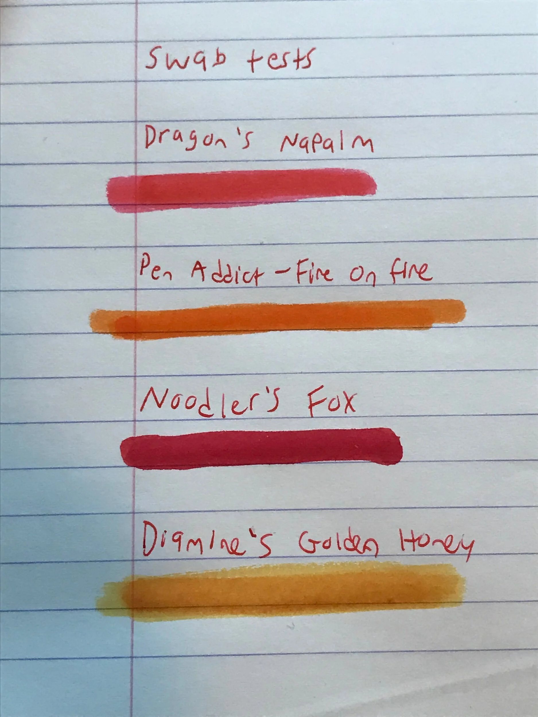
Diamine - Desert Burst - Ink Review
Hi all and welcome to day 7 my DIY Inkmas calendar
This morning I picked out Diamine’s Desert Burst. I picked it out of my ink bag and as I was inking it up I was trying to think of why it sounded familiar, and then I realized that it was the name of a pretty popular finish on guitars. I though it was a neat coincidence until I looked this ink up for some more info while writing this post, and it turns out that this is part of a line of inks Diamine makes inspired by guitar finishes.
Alright, story time over- let’s get to the review!
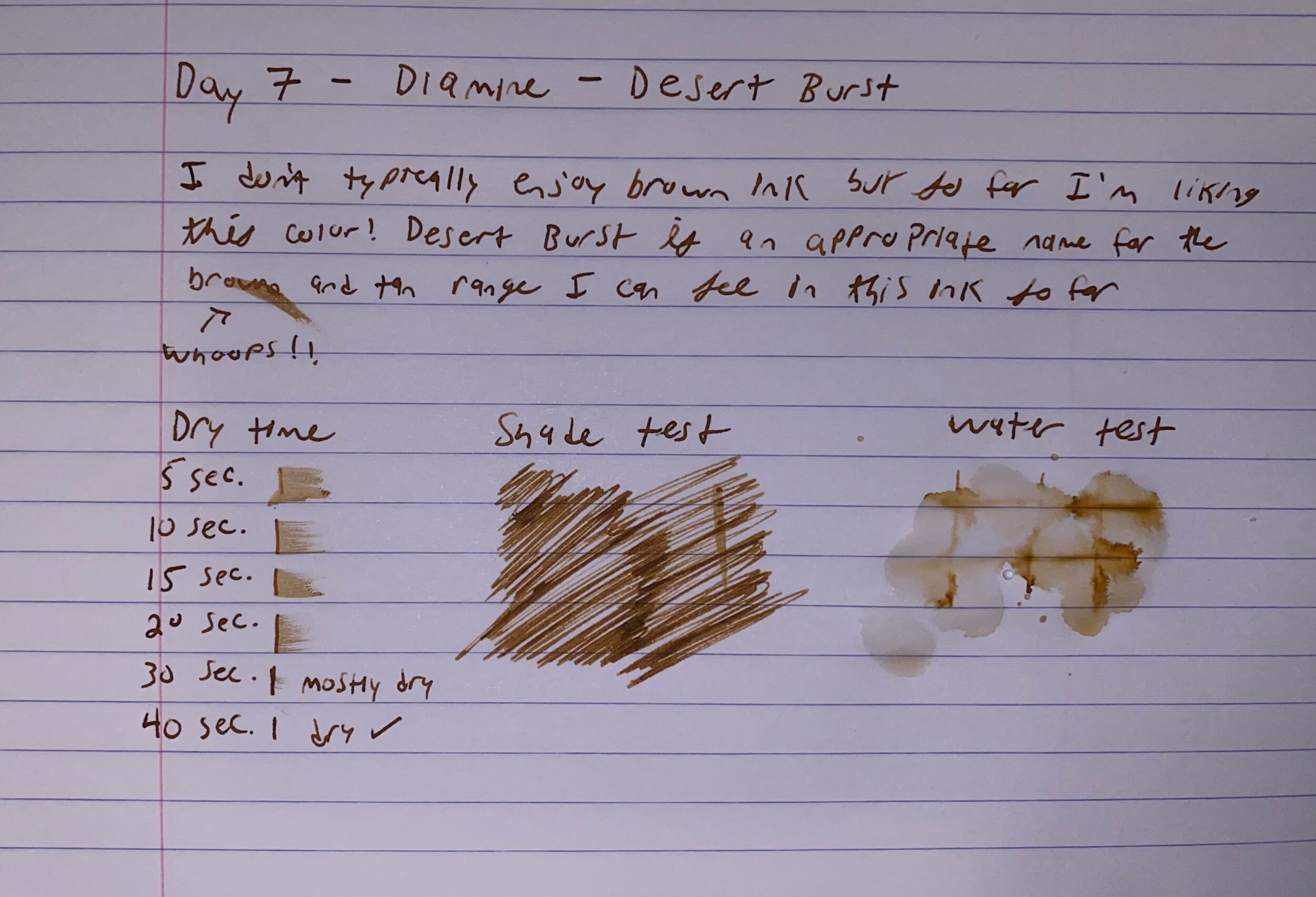
Sample and tests of Diamine Desert Burst
Writing
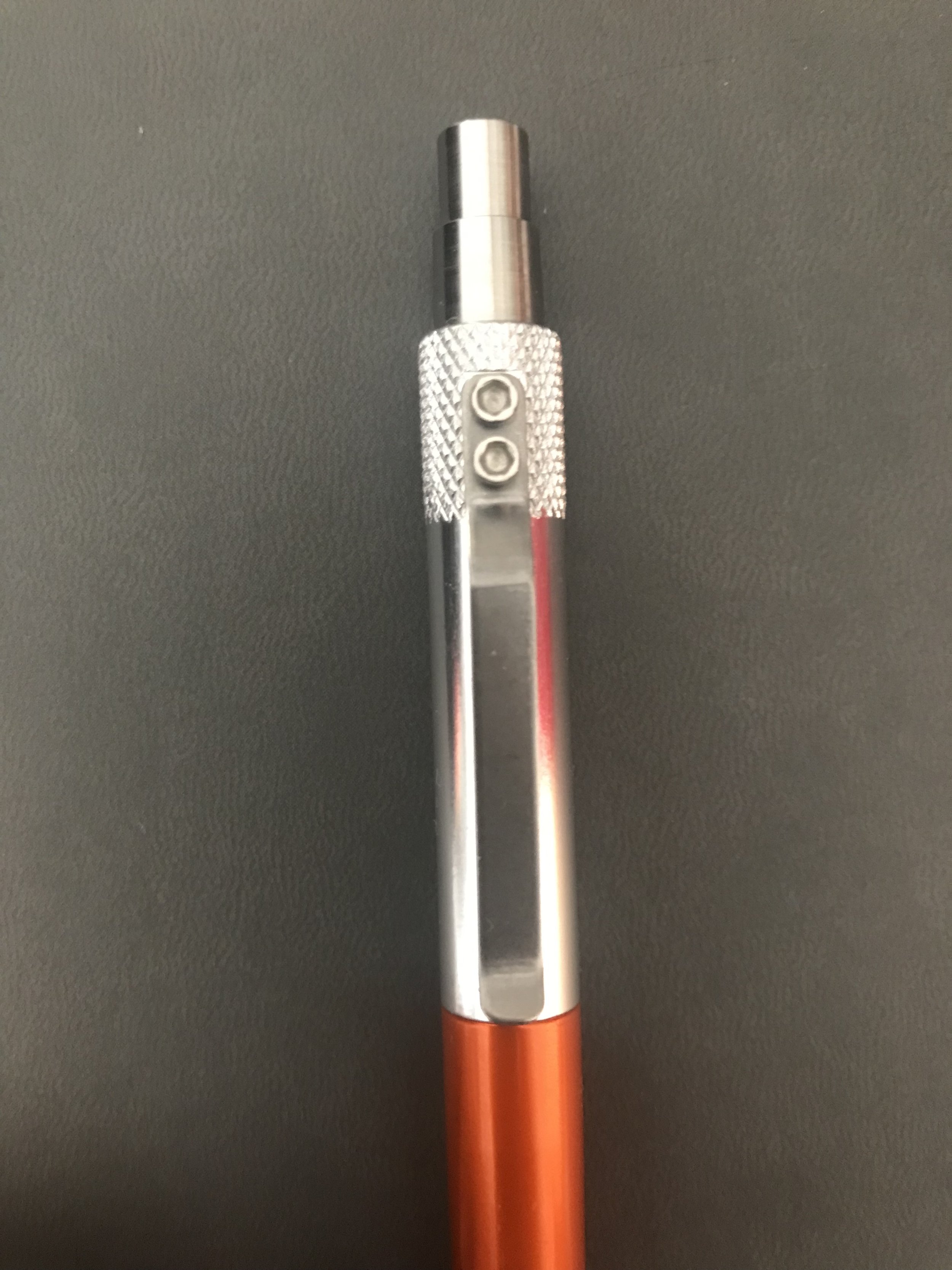
I loaded this ink up in my Noodler’s Nib Creaper and found that the flow was pretty average, and the ink went down pretty squarely on the wetter side.
I generally enjoy the way that Diamine inks write, and this one was no exception. It’s a dependable ink that I found wrote consistently throughout the day- it flowed well and stayed where you put it.
Dry Time
This ink was definitely on the longer dry time side- it was 90% dry at 30 seconds and fully dry at 40 seconds.
Water Test
This ink is absolutely not waterproof. It’s not advertised to be, but it was still surprising how little ink really held on to the page when some water drops were introduced.
Color
In the context of the guitar color Desert Burst, I really dig this ink. It captured the burst coloring idea well- the way this ink behaves as you write can give you a slight range from a deep brown to the lighter tan-sandy color. I really have no complaints in terms of the ink compared to it’s namesake coloring.
In the context of the color itself, I don’t know that I would write with it in my every day; that’s nothing against the color that Diamine has produced. It’s just that I don’t typically find myself writing with this color range.
Verdict
I really enjoy this ink- it’s a well behaved, predictable ink that I was pleasantly surprised by given how outside my usual color palette preference it is.
I’m casually into guitar playing, and always have wanted a nice collection in a range of colors, but for now I’ll just have to settle for this more affordable ink.
Thanks for reading, see you tomorrow for Day 8!