Black Lives Matter

I’ve been taking an extended break on this project, and while I’ve been preparing to come back to my love of pens, right now isn’t an appropriate time to begin posting again. In order to allow black voices speaking out to be heard, I will continue waiting to post. I encourage my fellow non-black folks to take this time to educate yourself- listen to black community leaders, understand the immense history of pain and violence inflicted on black folks, teach your children about this moment and all the moments leading to it, and research charities you’d like to donate to. If you’re able, set up reoccurring donations to these charities.
Because when the smoke clears the real work to continue change happens. This is not an isolated incident it is hundreds of years of systematically enabling violence against people of color.

Black lives matter-always and unconditionally.

Retro 1951 - Collection Highlights

Hi all and welcome back to Duck’s Doodles.

I’m sure by now, you’ve heard the news that Retro 51 as we know it is going to be no more. What exactly is happening is unclear, but things are going to change.

Retro 51 pens are just something special. They’ve been made for the last 30 years by pen people for pen people.

Retro was my entry into the pen world, and it became something to bond with other collectors over.

 It’s so rare to have something universally loved by a community, but Retro has certainly done it.

They’ll be missed, and I hope that someone can pick up the brand to carry it on (seriously, Retro folks if you’re reading this please consider selling it to Brad and Myke)

I thought what better way to celebrate this brand than to go through some of my favorite pens. 

So let’s take a look at some of my favorites in my collection to celebrate this amazing company

The Pen Addict Collaboration

Adjustments.jpeg

The one that started it all! My first review on this blog was this pen. It’s special to me, as Brad has always been a welcoming mentor to all in the pen community. It was the first Retro I purchased, and a kind collector in the community sold it to me for an amazing price because they were just thrilled to have someone else in the hobby.

Paris Skyline - Goldspot Collaboration

Adjustments.jpeg

You guys know I’m a sucker for all things dogs, and the French Bulldog in the beret cheers me up every time I see it. Plus, Goldspot was kind enough to include my review of this pen in one of their email newsletters. 

IMG_5564.jpeg

The Pulp Pens (Detective Edition)

Adjustments.jpeg

This isn’t a typical Tornado that I collect, but dang these Pulp Pens are fun. They’re decorated with various Pulp Magazine cover- the three I have are a detective story, a biplane dogfight and a monster stealing a damsel in distress. The Detective is my favorite of the three, so I’ve included it here. 

Cioppino

Adjustments.jpeg

Honestly, this pen is just downright the most gorgeous pen I own. When I think of Retro’s slogan ‘Life is too short to carry an ugly pen’, this is what I think of. This pen was a gift, and honestly it’s one I’ll cherish.


Thanks for reading everyone, I sincerely appreciate all that the Retro 51 company has done for the world of pens- creating an innovative brand with a dedicated community isn’t easy, but Retro has done a fantastic job.

And remember, life is too short to carry an ugly pen. So let’s celebrate the life of one of the best pen companies to have ever existed and carry only the best. 

Field Notes - Winter 2019 - Group Eleven - Review

Hey everyone! Welcome to the first post of 2020! I took a short break after the hectic schedule of the Inkmas advent calendar but I’m ready to start this year off! 

I figured a great place to start is one of my personal favorites- Field Notes!

The Winter of 2019 edition is the latest quarterly release- the Group Eleven edition. 

For some background, this edition is themed around Group Eleven on the periodic table: copper, silver and gold.

The Field Notes - 2019 Winter edition, Group Eleven

The Field Notes - 2019 Winter edition, Group Eleven

Outside

The set of three are standard Field Notes size (3 1/2 by 5 1/2) with all white covers. Depending on the metal they’re representing they have that color foil stamped for the “Field Notes” logo and the info on the back.

The edges of the pages are gilded with their respective metal colors, with the staple colors match.

These metallic colors really stand out on the very clean white covers. 

A better look at the gilded edges of the notebooks

A better look at the gilded edges of the notebooks

A closeup of the staples on the Group Eleven notebooks

A closeup of the staples on the Group Eleven notebooks

Inside 

The inside is made up of a dot-grid pattern. 

The dot grid is printed on a bright white paper, which certainly matches the outside. 

The dot grids themselves are printed in colors to match the foil and page gilding. These colors are pretty flat and, in my opinion, are washed out by the white page and the small dot size- especially the gold.

When I cracked these open, I was pretty shocked to see the inside of the covers were black. I think they likely did this in order to let the metallic inks really come through, but because of this when the top corners get a little crinkled or if there wasn’t a clean cut in the cover stock, it’s very noticeable.

Inside cover of the Group Eleven notebook- the ink and the fun fact sections will match whatever element of the three that notebook is themed to.

Inside cover of the Group Eleven notebook- the ink and the fun fact sections will match whatever element of the three that notebook is themed to.

Subscriber Exclusive 

The subscriber exclusive for this quarter is a fold up desk calendar- it neatly forms a standup triangle for handy date reference.

Each of the three sides is printed in an ink color that corresponds one of the three notebook colors.

Verdict 

Field Notes really swings for the fences on some editions (like with the National Parks edition) and to balance those projects they need to come up with some simple, but still story driven, notebooks. The Group Eleven edition is definitely on the simple, story driven side. 

I like this notebook. The bright white with the gilded page edges look very professional, and being a big science person I’m always for science themed Field Notes. I’ll probably use this for meeting notes, but I don’t know that I would say this edition ends up in my Top 5.

If you dig this edition, you can snag yourself a set here

Note- this review is of my own opinions, and I purchased these notebooks myself.  

Inkmas Review Roundup

Hi all and welcome to the last day of 2019 as well as the roundup of my top Inkmas choices. 

First let’s take a look at my top favorite, least favorite and biggest surprises before we get to some thoughts on the experiment.

Top 3 favorite inks 

  1. Noodler’s 54th Massachusetts: this ink just surprised the heck out of me. I didn’t expect to enjoy something yeah sounds as boring as “blue black” but I loved it. The story behind it also bumps it up 

  2. Diamine - Green/Black: I just didn’t think I would ever enjoy a green color. I stick to inks that have use for every day and this one honestly has found it’s way into my daily rotation, much to my shock. 

  3. De Atramentis - Document Blue: I love the idea of a functional color that will straight up outlive me 

Least favorite inks

  1. “Mystery Ink”- Colorverse Sea Europa: honestly this was my first Colorverse ink, and the fact that it was so far off I couldn’t identify it as the original color was disappointing. 

  2. Diamine - Desert Burst: I love the rest of the guitar line and will be reviewing them in the future, this one just fell in the color shade range I don’t love 

  3. De Atramentis - Document Yellow: I love the idea of an ink that will survive all time, I just hate that this one will burn my retinas out if I look too long 

Inks that surprised me 

  1. Noodler’s Blue Eel: it looked very middle of the road blue when I loaded it up, but woah does this ink POP

  2. Noodler’s Fox Red: I had no clue this ink was waterproof when I loaded it up. A waterproof red that’s a beautiful color is a wonderful shock 

On to some thoughts:

I wanted to do this DIY advent calendar as a personal challenge. I’ve been great at coming I’ll with ideas, but I’ve never been great at following through with ideas. This experiment just felt like this was something important that I try and really stick with; to prove to myself that consistency is something I can achieve. 

I don’t think I could have picked a worse time to give this a shot- I was traveling all of December for work, I decided to start two podcasts and my mom had been diagnosed with a serious illness and I was helping to care for her. 

I was posting day after day (only later learned Squarespace wasn’t posting some to the main blog page, but that’s a story for another day), not really sure how it was going but enjoying the push of a daily deadline.

The support I’ve received this month has been incredible beyond words. I’ve had 5 times as many new visitors this month as I have in the history of the blog, I’ve had folks emailing me and encouraging me. I’m so privileged to be in such a supportive community.

Thank you all, so much for reading anything I’ve ever put out. 

I can’t wait to get started on next year’s blog posts. 

Pelikan - Brilliant Brown - Ink Review

Here we are- Day 24 of Inkmas. This has been a really great challenge for me- forcing myself to be accountable for a consistent activity has really been an important learning experience. 

I’ll have a whole post where I go review this whole exercise in ink-sanity, but for now let’s get to it.

One final fun surprise was today’s ink- my first Pelikan ink, Brilliant Brown

Adjustments.jpeg

Writing 

This ink goes down a bit on the wet side, and overall provides a smooth writing experience.

I experienced no feathering in my Rhodia notebook and only a little bit in my Field Notes.

I experienced no bleeding through on my Rhodia and some on Field Notes.

This ink is one that “pools” in certain areas of your letters as you write, which I enjoy.

Dry Time

On my Rhodia, this ink was mostly dry at 20 seconds and fully dry at 30 seconds.

Water Test

This ink isn’t water proof or water resistant. 

It’s not advertised to be, but it’s still surprising how all the ink got pulled up off the page with water being introduced.

Color

Brilliant brown is a very apt name for it; it’s a bright, single note brown.

It gets almost orangey-deep reddish in certain lights.

There’s no real shade to this ink, but you can get some range from bright to deep brown. 

I don’t use my pens and inks for art but if you do,  I expect this ink would be a great addition to your color shade arsenal.

Verdict 

What a cool shade of brown. Brown is usually such a sad, boring color but this was a really pleasant surprise.

I don’t think it’s particularly great for “work” type colors (unless you work in a cool office), but it’s a nice, unexpected color and a good writer. 

Thank you all for reading, happy writing, and I’ll see you soon for my wrap up post of my DIY Inkmas advent calendar! 

Rohrer and Klingner - Leipziger-Schwarz - Ink Review

Hi all, and welcome to day 23 of Duck’s Doodles Inkmas! 

Nearing the end and this experiment is still full of surprises- I pulled an ink from a company I’ve never heard of. Today’s review is on Rohrer and Klingner’s shade Leipziger-Schwarz.

Adjustments.jpeg

Writing 

This ink goes down pretty smooth- a little on the drier side both in my Pilot Prera and my Lamy Safari.

I found no feathering on my Rhodia, but had some in my Field Notes

Dry Time

I found this ink to be dry in 20 seconds with my Pilot Prera and closer to 30 seconds with my Lamy

Water Test

This ink isn’t waterproof and it’s not advertised to be 

Color

This ink is (I think) supposed to be a deep black but it’s 100% a blue-black. It looks not quite black in the vial, and the deconstruction in the water test shows then blue very clearly.

There’s no real shading to this ink; it’s a pretty flat blue-black. 

Verdict

For my first experience of a Rohrer and Klingner ink, this was pretty good!

It’s a dependable writer and is a very work friendly color.

Thanks for reading, happy writing and I’ll see you tomorrow for the last Inkmas post!

Diamine - Oxford Blue - Ink Review

Hi all and welcome to Day 22 of Duck’s Doodles Inkmas!! I can’t believe how close to the end we are

Today’s pull was Diamine’a Oxford Blue

I’ve had a lot of blues this Inkmas and when I pulled this was kind of “eh” about it.

But as I wrote I really wound up enjoying this shade. 

Adjustments.jpeg

Writing

I’ve really come to respect Diamine’s consistency over these last few weeks- no matter the ink, you’re getting a quality writing experience.

Oxford blue continues this trend. It’s on the wetter side, and is a smooth writer with no flow issues. 

I had no feathering on my Rhodia, and only a tiny bit on my Field Notes.

Dry Time

This ink is fully dry after 30 seconds on my Rhodia. which is about what I expected for this wet writer. 

Water Test

This ink isn’t water resistant or water proof. 

Almost no ink stays on the paper when water is dropped on it after 3 full minutes of dry time 

Color 

This ink looks super dark, almost midnight blue/black in the sample vial. But while writing it was more of a rich Navy color. 

There was not any shading exactly, but as I was writing I noticed some lighter deep blue and a deep deep blue.

I also noticed some interesting hues while writing- it was blue but...exaggerated by something else. It wasn’t until I did the water test that I got a better picture 

The water test is fun because it can really help you get a clear picture of the ink’s color properties- I noticed a slight light pink area in the water test, and as I was writing I noticed a bit of a pinky/red sheen-the odd hue I mentioned before.

Mountain of Ink had some amazing photos of this sheen, I totally recommend checking out Kelli’s pics because they convey this color so clearly

Verdict 

This is a really reliable ink. It goes down wet, writes smooth and has a fair dry time. 

It’s a really nice blue, and honestly if you’re looking for a workhorse blue this is a good candidate

Thanks for reading, happy writing! See you tomorrow for Day 23!!

Noodler’s - Polar Brown - Ink Review

Hi all and welcome to Duck’s Doodles Inkmasday 21!

Today I pulled out Noodler’s Polar Brown, awfully fitting considering how cold it is here today in the Northeast.

This ink is designed to be cold-proof (hence the Polar moniker), as well as waterproof, bleach proof and ethanol proof.

IMG_4848.jpeg

Writing

I loaded this ink into my Noodler’s Nib Creaper, with a flex nib.

I was fully expecting this to ink to be wet, like most Noodler’s inks, but was actually on the drier side. 

I had no feathering in my Rhodia writing sample, none really in my field notes and some feathering on copy paper


There was some bleed through on my Field Notes, but none on the Rhodia. 

It was a pretty smooth writer, I had a little bit of skipping initially but once it got going it was smooth sailing.

Dry Time

This ink was essentially dry after 5 seconds. I was pretty shocked, since I never know how these nuclear-proof ink formulas will affect things like dry times.

Water Test

This ink has only a little tiny bit of ink come up immediately after writing, and is totally waterproof after 2 minutes of waiting

Color

This ink is a nice, deep chocolate brown.

You don’t get any shading out of it, but since this ink is bulletproof everything is a trade off.

Verdict

I really enjoy this shade of brown. The chocolatey hue looks great, and is a dependable writer.

The idea of an ink I can leave in pens that can be safe if I accidentally leave them in my car is A+ in my book.

Thanks for reading, happy writing and see you tomorrow for day 22 of Inkmas! 

De Atramentis - Document Yellow - Ink Review

Hi all and welcome to Day 20 of Duck’s Doodles Inkmas.

We’re in the home stretch here folks. I’ve been so focused on inks I’ve hardly gotten my Christmas shopping done....thankfully I  have a mall here in town!

Today I pulled out De Atramentis Document Yellow. I’m actually really happy with this one, since this will let me see if the color of an ink affects the formula. If you’d like to read my Document Blue review you can check it out here 

Okay, let’s take a look:

Adjustments.jpeg

Writing

This ink is just a smooth writing as it’s blue counter part. It’s pretty thick and viscous, and goes down wet.

This ink is designed to stay where it’s put and it 100% does.

There’s no feathering on my Rhodia or Field Notes, and only a little bleeding through on my Field Notes.

Dry Time

Looks like the color does affect the dry time, but only a little.

The blue was mostly dry in 5 seconds, and totally dry at 10.

Where as this yellow was mostly dry at 10 seconds and 100% dry at 15 seconds 

Water Test

Color also affects the water test- when I review water proof or water resistant inks I’ll drop water immediately after writing and then about 2 minutes after. 

The ink definitely stayed down when water was put on right away, but some was pulled up

After two minutes of drying it absolutely was cemented into the pages.

This is different from Document Blue, where it was totally locked in from the second it hit the page.

Color

This is more highlighter yellow than an actual highlighter. It’s a beautiful, bright yellow that can be like staring into the sun if you’re not careful. I love the brightness to be totally honest.

But it’s impractical. You can hardly see it while writing on white paper. 

It’s pretty flat, in terms of there being no variation, but this being a professional-aimed ink beautiful tones aren’t the aim

Verdict


Even though there was minor differences in performance the writing experience was nearly identical. All in all, I was pleasantly surprised that De Atramentis was able to have such consistency in the Document Ink line, even with such dramatically different colors. 

I don’t have a use for a yellow that will outlive me, but I really love just how intense this formula is.

Thanks all, happy writing see you tomorrow for day 21!

Monteverde - Capri Blue - Ink Review

Hi all and welcome to day 17 if Duck’s Doodles Inkmas!


Today I pulled out Monteverde’s Capri Blue

Adjustments.jpeg

Writing

This ink goes down on the wet side- I wrote with it in my Pilot Prera (fine nib) and in my Lamy AL Star (medium nib) 

The medium nib 100% lets the beautiful deep blue tone of this ink shine through, but I found it was SUPER wet.

It bled through no matter what pen I was using.

I noticed some feathering on my Leuchtturm journal I use at work, and it feathered like crazy on regular copy paper 

Dry time

The initial dry time I had was 10 seconds, but was suspicious of that. It stayed 10 seconds with my fine Prera, but was closer to 45 seconds with my medium Lamy.

Water Test

This ink isn’t waterproof or water resistant. At all. 

That’s not a bad thing since it’s not advertised to be either, but normally there’s at least a little left when water tests are done.

Color

It’s a really nice jewel toned blue. The fine nib doesn’t do it justice, and even though it’s such a wet ink it’s worth loading it up into a wider nib and letting it dry 

Verdict

It’s a nice blue! The dry time is a major drawback for me, since I usually use my pens to take quick meeting notes and therefore long dry times are a no go for me.

But, if you enjoy blues and have some time to let them dry, it’s worth the purchase

Thanks for reading, happy writing and see you tomorrow for day 18!

Diamine - Sherwood Forest - Ink Review

Hi all and welcome to Day 16 of Duck’s Doodles Inkmas!

I realize it’s been a few posts since I’ve explained this experiment so the summary is I’m doing my own DIY ink calendar- one ink gets drawn from a random set of 24 ink samples and gets a quick review.

Okay now that we’re all caught up, let’s look at Diamine’s Sherwood Geen!

Writing sample, dry time, shade test and water test of Sherwood Green

Writing sample, dry time, shade test and water test of Sherwood Green

Writing

I have to say I’m absolutely in awe of how consistent Diamine has managed to be-no matter the color or properties, you get a good writing experience.

This ink goes down pretty in the middle- maybe a tiny bit on the wetter side, but not so much that it’s just gooping out of a pen. It’s a nice smooth writing experience- I loaded up my Prera (fine nib) and my Lamy AL Start (medium nib). It wrote just fine in both, but I found I enjoyed the writing experience a bit more in the Lamy.

This, like most Diamine inks, stays where you put it- I noticed no feathering on my Rhodia notebook, a tiny bit on my Field Notes and some noticeable feathering on low grade copy paper.

I did notice some ghosting on my Field Notes and the copy paper, but none on the Rhodia notebook.

Dry Time

This ink was fairly dry at 15 seconds, almost 100% dry at 20 seconds and absolutely 100% dry at 30 seconds.

Water Test

This ink isn’t waterproof but it’s not advertised to be.

The water drop test really brought out how green this ink is- I think it would be a good candidate for anyone using their pen inks for art

Color

I was really not expecting a ton from this ink- I really loved the Diamine Green/Black I tried out the other day for Inkmas, but didn’t think that two greens from one company would interest me.

Boy oh boy was I wrong.

Green/Black occupies that exact space- a green that has clear undertones of black.

And Sherwood Forest completely dominates the “forest” space- it really gets a surprising amount of range that encompasses “forest”. A deep green, with almost an undertone of blue, all the way to a light grass green.

Verdict

Holy moly guys I love this green. I’m shocked at how much I dig it, honestly.

It’s a really great green color with a lovely color range, a pretty great drying time and it’s a good writer.

That’s a home run in my book!

Thanks for reading, happy writing and see you tomorrow! 

De Atramentis - Document Blue - Ink Review

Hi everyone and welcome to day 15 of Duck’s Doodles Inkmas

Today’s inky goodness is De Atramentis’ Document Blue. 

This ink is advertised to be everything-proof- It’s designed to not be tampered with so it’s waterproof, lightfast (won’t fade) and resistant to solvents like ethanol

Adjustments.jpeg

Writing

I expect inks that have such permanence to write...less than perfect. In the vial this ink is pretty thick looking and I wasn’t sure what to expect. Inks with special properties often have some pretty serious trade offs.

Despite all the wonky chemicals that 100% are loaded into this ink, it flowed reasonably well.

There was 100% no feathering on my Rhodia or on my Field Notes. This ink is STAYING where you put it.

There was some ghosting on my Field Notes, but didn’t notice it on my Rhodia 

Dry Time

I know this ink is for writing important things so I figured the ink would take a while to settle into the paper and dry

I was absolutely shocked to see it was essentially dry after 5 seconds. There was a very tiny smear at the 5 second mark and it wasn’t going anywhere at the 10 second mark.

Water Test

As noted above, I was expecting this ink to take a bit to dry into the paper and therefore take a bit for the full effect of its waterproof-ness to take effect

Whenever I test an ink that’s touted as waterproof I do two water tests- one where I immediately introduce water and the usual one where I wait 2 minutes for it to saturate the paper and then introduce water. Often, these waterproof inks have to react with the cellulose in the paper fully to be “locked in”, so the instant water test pulls some ink up and leaves some in the paper

That was absolutely not the case here. The second this ink hit the page it was not going anywhere with this water. 

In fact, I goofed up and forgot to label which test was which so if you look at my water test where I wrote the word “right” it was being written *where there was some water*, and it STILL mostly stayed put.

Color

There’s not a ton to comment on - it’s a very standard, professional shade of blue with no discernible shading or variation. 

It’s advertised to be for official documents and so it lives up to a very good, standard, office-themed blue.

Verdict

It’s a nice, professional blue color and is honestly as document-grade as advertised 

I’m thoroughly impressed with this ink. I don’t personally have much use for nuclear apocalypse-proof ink, but if you’re looking for one this is a good option!

Thanks for reading, happy writing and see you tomorrow for day 16 of Inkmas! 

Noodler’s - Cayenne - Ink Review

Hi all and welcome to Day 14 if Duck’s Doddles Inkmas!

Out of today’s grab bag I pulled Noodler’s Cayenne 

Let’s get to it!

Adjustments.jpeg

Writing

This ink definitely goes down on the wetter side, and has a nice flow to it. I didn’t have any trouble getting this ink started in my Noodler’s Nib Creaper

I didn’t have any feathering on my Rhodia notepad but 100% saw feathering on every other paper I tried- field notes, copy paper and sticky notes 

Dry Time

I’ve seen this ink written about before and most folks said it has a quick dry time, but mine was pretty firmly between 30-60 seconds depending on the paper. 

Now, I did only have this ink loaded up in the Nib Creaper, which has a flex nib, so maybe it was really just spitting the ink down on the page. 

Water Test

This ink isn’t water resistant and it isn’t advertised to be.

This has been one of my favorite water tests because it really deconstructed the ink- you can see the shade range of yellows and oranges that are in this ink.

If you like using your fountain pen inks for art, this is a good candidate for you to get a bunch of different shades with.

Color

This ink is the next in the shade range after Apache Sunset- where Apache was a golden honey yellow to a light orange, this is a light orange to a dark orangey-red color. 

It’s a pretty vibrant shade of orange,  it definitely is a bit more flat than the Apache Sunset. I didn’t notice as much shade variation while writing.

Verdict

I like this ink! It’s not as easy to get a range of shades as other inks but it stays  in a color family it does well. It goes down well.

If you like orange inks and want to add a little flavor to them, this is a good candidate. 

Thanks for reading, happy writing and see you tomorrow for day 15!

J. Herbin - Éclat de Saphir - Ink Review

Hi all and welcome to day 13 of Inkmas! 

Today’s ink is my very first J Herbin ink. It’s the Eclat de Saphir, which just sounds too fancy for my mortal hands to ever touch.

So I loaded it up and wrote a whole bunch with it!

Let’s look:

Adjustments.jpeg

Writing

This ink goes down WET. It practically spilled out of my Nib Creaper, and I loaded it up in my Prera and it still went down went.

I do recommend to get the full effect of how rich this ink is that you really ink it up in a medium or broad Japanese nib or a medium western-style nib.

This was a pretty well behaved ink- no real feathering except on the usual office copy paper 

Dry Time

This ink is advertised as fast drying. I don’t know what I’m doing wrong but....it was pretty average for a wet ink. It was about 35 seconds on my Rhodia

I don’t know if there was something I did wrong here, or if their dry time is with a finer nib (and therefore less ink to soak into the paper), or if my Rhodia’s pages are too thick for the standards of J. Herbin’s dry time test but I wasn’t overly impressed 

Water Test

This ink isn’t water proof and isn’t advertised to be.

You can really see the brilliant blue dye with the water test, so if you use your fountain pen inks for art this is a good candidate 

Color

There have been so many blue-family colors this Inkmas but my goodness this one is standing out.

It really does have this brilliant hue to it, that’s a little hard to describe.

The color doesn’t really have any shading.

Verdict

I was pretty impressed with my first J. Herbin ink! 

I was a little disappointed in it being touted as a quick drying ink and it being pretty typical for dry time, but the beautiful blue color and the awesome flow more than negate that.

Well thanks for reading, happy Friday the 13th and I’ll see you tomorrow! 

De Atramentis - Atlantic Blue - Ink Review

Hi all and welcome to Day 12 of Duck’s Doodles Inkmas calendar!

What a wild week this has been- I’ve been traveling all over for work while writing these reviews so please excuse the lateness on today’s!

Okay so let’s take a look at De Atramentis Atlantic Blue

Adjustments.jpeg

Writing 

Woah this ink writes sooooo smoothly. I was writing with a Fine nib Prera and it was an awesome flow rate. If you use a Medium or Bold nib I would just be aware this likely will get spit right on to the page 

It’s pretty well behaved and I didn’t notice any terrible feathering on most papers (Rhodia, field notes and copy paper) though there was a bit as I was writing on a sticky note

Dry time

For going down on the wet side I was surprised that this ink really had a 20 second dry time on my Rhodia. It was a bit longer on my Field Notes, more towards the 30 second mark

Water test

This ink isn’t waterproof and isn’t advertised to be. 

I was impressed how well this ink gripped the paper when water was introduced to the paper. It certainly did get blurry but the cross hatch lines I made were still clear

Color

Woah what a nice deep blue.

There’s no shading, it was consistently deep blue as I was writing and even in the shade test.

It pops pretty well, so it’s a step above a standard blue.

Verdict 

A nice blue! It’s worth adding to your collection if you’re nutty about blue inks or if you’re looking for a good all purpose blue

Thanks for reading, I’m gonna knock out from all this traveling. See y’all tomorrow for day 13! 

Noodler’s - Fox - Ink Review

Hi all and welcome to Ducks Doodles Inkmas day 18! Today’s goody is Noodler’s Fox red


Let’s take a look-

Adjustments.jpeg

Writing

This ink, like most Noodler’s ink, goes down wet.

It goes down every wetter than I expected, and honestly it feathered some on my Rhodia paper which was shocking.

It feathered like crazy on both Field Notes and general use copy paper.


There was a little bleeding through in all paper, but barely any on my Rhodia.


Dry time

This ink took a solid 20 seconds to be mostly dry, and was totally dry at 25

Water test

This ink is advertised as water resistant and is absolutely water resistant.

When I test water proof or water resistant inks I’ll always test immediately after writing and wait 2 minutes for it to soak in.

Both tests had about the same amount of ink drawn out of the paper, but the ink largely remained on the paper 


Verdict

I fully appreciate a water resistant red. I really do. This color might be a bit flatter than some other reds on the market but it’s orangey-red hue is a nice color and Noodler’s inks are pretty consistent.

If you like red family inks it’s worth adding to your arsenal

Thanks for reading and I’ll see you for Day 18 of Inkmas! 

Diamine - Green/Black - Ink Review

Hi all and welcome to Day 11 of Inkmas!

I pulled another Diamine ink out of the goodie bag today- a shade I had never heard of actually.

I wasn’t quite sure what to make of a color described as green/black, but hey I generally enjoy Diamine inks so I inked it op in my Lamy AL Star (medium nib) and started writing.

Let’s get to taking a closer look:

Adjustments.jpeg


Writing

This ink, like most Diamine inks, goes down on the wetter side. 

I experienced no flow problems, and it was generally well behaved. 

I also experienced no feathering- it was pretty much staying where you put it, even on my field notes notebook. I did experience a bit of feathering on office copy paper, but that’s typical of fountain pen ink on this type of paper. 

Dry Time

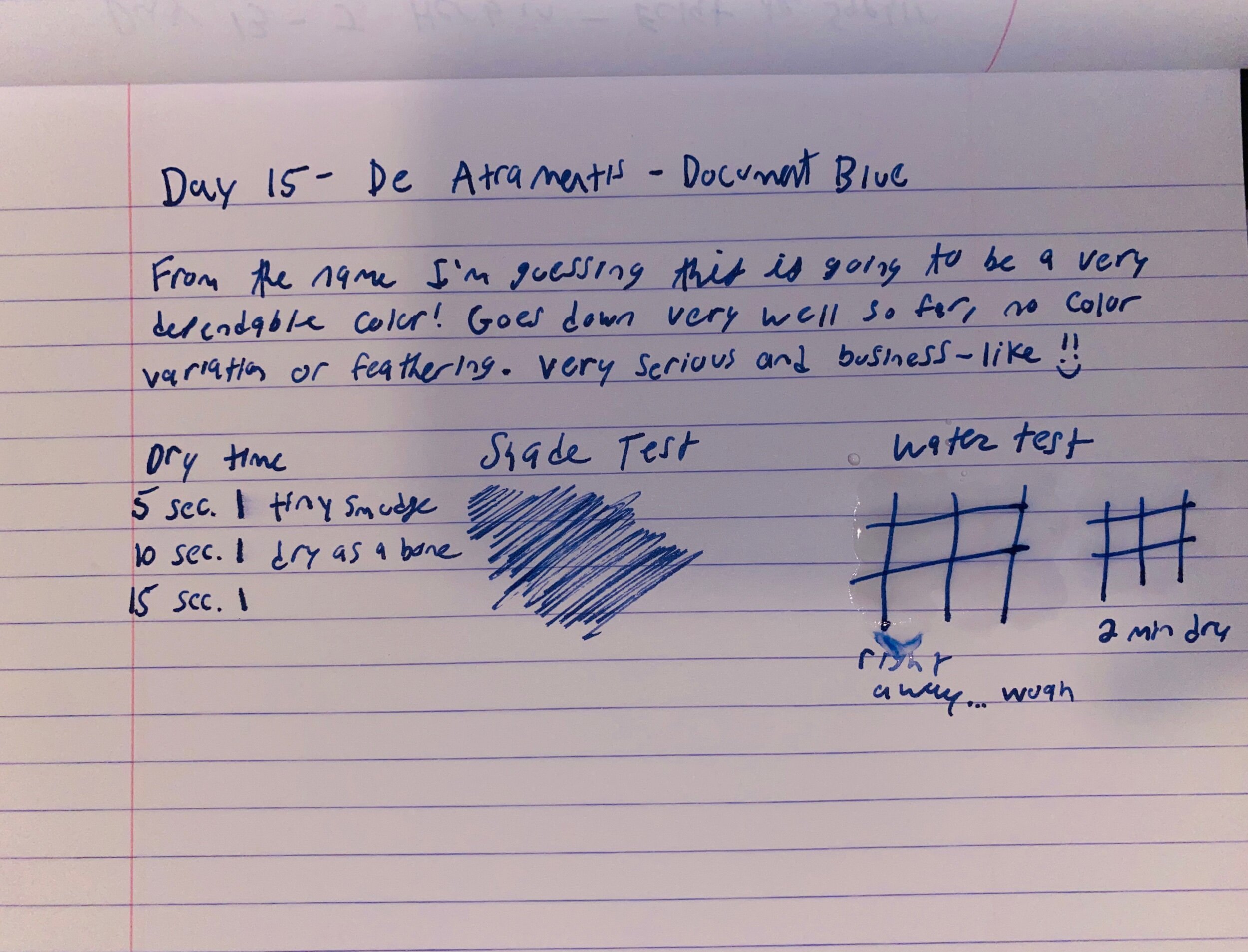
Since it is pretty firmly on the wet side of the spectrum, I was expecting a 45+ second dry time, and it came in just under that.

It was pretty dry at 30 seconds but fully dry at 40 seconds

Water Test

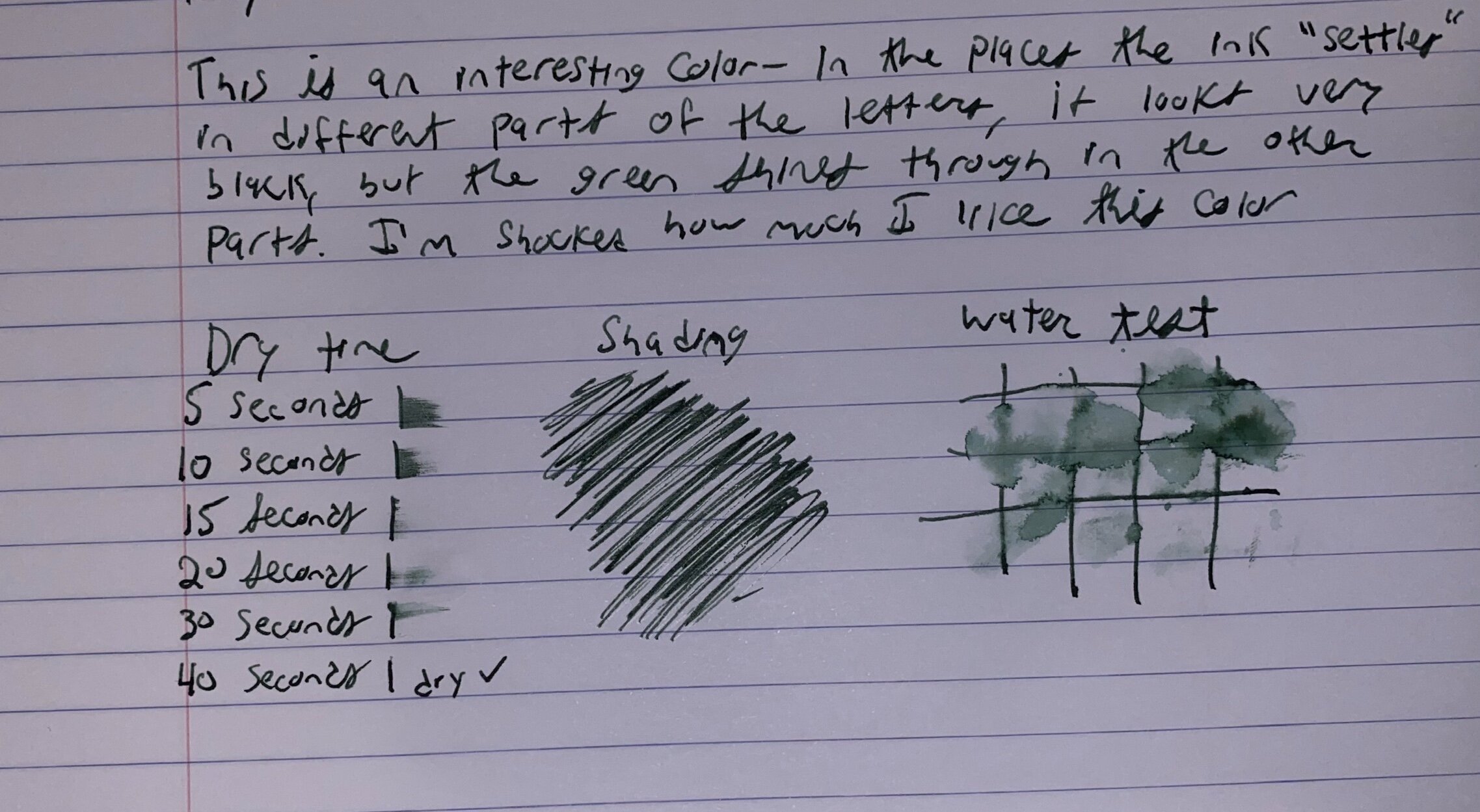
This ink isn’t waterproof but it also isn’t advertised to be.

Even after a good 3 minutes being soaked into the paper, the ink came up fairly easily when some water was dripped on it. You do get some cool, shaded green colors with the water drops, so if you use fountain pen inks for art you can for sure get some neat effects out of this color. 

Color

The picture of the writing sample simply doesn’t do this color justice. I was surprised at how green it was, given how dark it was in the sample vial.


A nice spectrum of color was present, from basically pure black to a deep forest green. 

I like inks that are sort of...incognito. They can be used in business scenarios without drawing too much attention, but you know the truth, and know that they’re secretly something so much more fun than a boring ol’ plain black ink.

This is for sure one of those inks- it’s deep and dark so it looks black at first glance, but if you pay attention there’s this really rich green that shines through. 

Verdict

I really love this ink- I was surprised since I don’t think I’ve really tried a green ink before. 

It wrote well and was well behaved, a level of consistency I’ve grown to expect from Diamine’s inks.

Okay, that’s all for this review. Thanks for reading, happy writing, and see you tomorrow for Day 12!

Noodler’s - Borealis Black - Ink Review

Day 10 of Inkmas!! Oh my goodness I can’t believe how fast this is going

Out of today’s grab bag I pulled Noodler’s Borealis Black- the first true black ink of the Inkmas calendar

When I was loading my pen up I had some ink on my hands from cleaning out the previous few days pens, and totally thought some blueish purple was from this ink, so when I was writing my writing sample I was confused when I didn’t see any purple, whoops!

Okay, review time!

Noodler’s Borealis Black writing sample

Noodler’s Borealis Black writing sample

Writing 

This ink, like most Noodler’s inks, goes down firmly on the wet side of the spectrum. The flow on this ink is great.

I’ve said this previously but I’ve only come to expect the best behavior of Noodler’s inks and Borealis Black is no exception; it pretty much stays where you put it. I noticed a tiiiiiny bit of bleeding on my Field Notes, and some feathering on general copy paper, but on my Rhodia I had no troubles at all

Dry Time

Wheew this one takes a while to dry.

On my Rhodia it’s solidly in at the 40 second mark.

Beware, any lefties or folks who were planning to use this for work notes- this one takes it’s sweet time to dry

Water Test

This ink isn’t waterproof, nor is it advertised to be. 

Like most Noodler’s inks it sinks pretty well into the page, so even when water is introduced and the color comes up, some is still retained.

I didn’t notice any shocking results from the water test that would usually prompt me to recommend it to folks using their pen ink for art.

Color

This ink is BLACK! I mean deep, dark, lost in space time black. “In space no one can hear you write” type of black. 

If you’re looking for something on the extreme end of the spectrum, I’ve found your ink.

Verdict

I really dig it! I generally am not a fan of black inks, even in Bic pens I always gravitated towards the blue ones, but this is a *really* nice black ink.

The drying time is a bit on the long side for my meeting-note needs, but I’ll certainly be happy to keep playing around with it.

Okay, thanks for reading! Happy writing and see you tomorrow for Inkmas Day 11!

Mystery Ink Review- Update

Hi all, just wanted to have a super quick update to yesterday’s mystery ink!

I reached out to the folks at Goulet and a customer service rep let me know that Sea Europa wasn’t being carried at the moment by Goulet anymore because there were some issues with the consistency of the coloring (thanks for the info Chase!)

So, it might be Sea Europa after all but I just got a really off batch. Knowing this I just can’t recommend getting this color ink. It’s a bit of a dissapointment, since that was my first Colorverse ink. Ah well, there’s thousands of more inks in the world!

Okay, thanks for reading, happy writing, and I’ll see you later today for Inkmas day 10!

Mystery ink review

Hi everyone, welcome to day 8 of my Inkmas calendar!

Today I drew out of the bag an ink sample labeled Colorverse’s Sea Europa. I was pretty psyched because I’ve never had the chance to use a colorverse ink, and I knew Sea Europa had a rusty red color that I’ve wanted to try.

But....I don’t think this is Sea Europa. This ink is just....not a red color. At first I thought it was because of the low flow I was getting in my one pen, so I swapped to another. Then I thought maybe because these are plant based inks they’ll take a little bit to dry and develop their color. But nothing changed from this brownish color so....I’m positive this isn’t Sea Europa. If you’d like to see a review with some swabs of actual Sea Europa, here’s a link to Mountain of Ink ‘s blog post about it. 

Well, no matter. I’ll review the mystery ink! 

Adjustments.jpeg

Writing 

This ink goes down pretty dry. I had it in my TWSBI GO and then in my Lamy AL Star (both medium nibs) and I found it to be a low flowing dry ink.

I imagine if you lean towards fine Japanese nibs you’ll be getting a lot of feedback from the paper as you write 

Dry time

Since this ink went down pretty dry, I was expecting around 15 seconds for dry time and it turns out that was a pretty good guess- it was mostly dry in 15 seconds and totally dry in 20 seconds 

Color

This ink goes down as a pretty even brown- I didn’t notice any shading or color difference as I was writing, or any difference between the two pens I had it inked up in.

I’d describe it in the chocolatey brown family. 

It’s a nice brown, but I’m not a huge fan of brown colors in my pens personally. 

Verdict

Well, whatever this ink was it’s cool! A bit on the dry side but overall not a bad writer. I bought these ink samples from Goulet, and this is just an accidental mislabeling. I suspect it’s actually still a Colorverse ink, it might actually be Hubble Zoom or Space Laika- due to computer display differences it’s a little hard to compare my ink sample apples to apples with the other colors.

Oh well, this was actually pretty fun not knowing what ink it was! Maybe I’ll start doing blind reviews of ink

Thanks for reading, see you tomorrow for day 9! Happy writing!